Twitter is testing a new layout for reply threads and accidentally upsetting its users in the process. To call the reaction “negative” would be an understatement, and many people fear this will be a permanent change.
Twitter isn’t new to testing new features and tweaking its functionality. It seems there’s always some sort of beta or feature with limited availability due to testing. Right now, for example, the platform is also testing a prompt that will want people before they post replies that could be considered “harmful”. There’s been a beta version of a scheduled tweet feature running for over six months now, which would be huge for brand accounts making new announcements. Earlier this year, Twitter even adjusted its moderation policies to account for coronavirus-related misinformation.
The latest idea is an alteration to the existing comments layout and fans seem to hate it. One user summed up the majority reaction rather succinctly, saying, “I don’t know if you have blind people designing this [expletive] but I won’t be using twitter until it’s changed”. It’s astoundingly difficult to find a single positive response to the change, as is usually the case since people aren’t generally their best selves when responding to popular accounts online, but it’s weird in this case because other social platforms use a similar system and no one seems offended.
How Twitter’s New Comment Layout Works

The easiest comparison for the new reply system Twitter’s testing is Reddit. Anyone who has ever seen comment threads on that site has the basic idea. Underneath a Tweet will be a comment, and under that comment, there’s a “Show Replies” button. Tapping that opens the replies to that comment, organized in a list after a slight indentation.
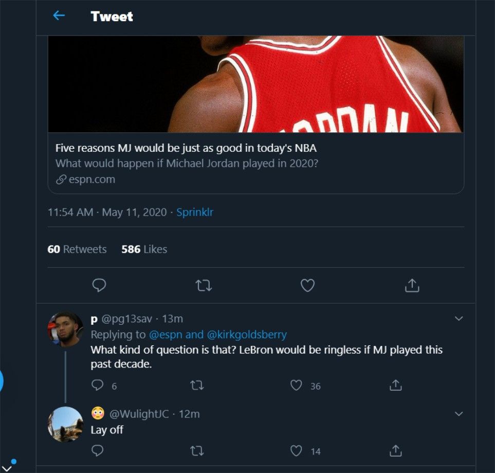
It’s a huge upgrade from the existing Twitter reply system, which makes it incredibly difficult to track a reply thread. Right now, clicking “Show Replies” opens a list of every post tweeted as a reply to the original. If anyone replies to those replies, you can’t see those responses without clicking that particular tweet and checking its comments. For example, the comment highlighted below 6 replies, but only one of them appears in the thread of the original post. To see the others, you’d have to click that comment’s tweet, and if anyone replied to those, you’d have to click those tweets, eventually going multiple pages deep to keep track of a conversation.
Facebook and Reddit solved this problem years ago. Facebook simply keeps all replies to a post in one unique thread, rather than having each comment function as a new post. Reddit uses the indentation option Twitter seems to be emulating. Reddit’s implementation is admittedly better since it has more options for collapsing and expanding those threads, but Twitter’s version is in beta still. Either way, given the obvious benefits of this new system, and how well it works for other platforms, the negative reaction is baffling.
There is one valid complaint in all the vitriol, though. Currently, the icons below a tweet are (from left to right) for comments, retweets, likes, and sharing. These all appear beneath every reply. With the new system, they’re only visible after clicking on the reply itself to enlarge the tweet. It’s a small inconvenience that could easily be remedied if Twitter decided to simply add those icons to replies in the new format as well. Ultimately, this controversy seems like something that could have been avoided with a choice to opt-in or out of the beta. Users seem to be selected at random to try these new reply threads and don’t have a way of switching back to the old style. Hopefully, Twitter responds soon and doesn’t abandon the idea entirely based on feedback.