The French Dispatch’s changing color and aspect ratio meaning explained. Writer-director Wes Anderson’s latest film is inspired by his love of The New Yorker — the character Arthur Howitzer, Jr., The French Dispatch’s editor-in-chief, is an amalgamation of New Yorker’s co-founder Harold Ross and editor William Shawn. Anderson utilizes a black-and-white scheme alongside disparate colors throughout, as well as varying aspect ratios — 1.37:1 and 2.39:1, respectively. The film contains his signature precision and brightly colored production, but The French Dispatch is slightly different from Anderson’s past films because of the changes made throughout.
Set in the fictitious France city of Ennui-sur-Blasé, The French Dispatch is a collection of three short stories tied together by the writers of the eponymous publication, hand-picked as the final articles the magazine would print following the passing of Howitzer, Jr. The first story, “The Concrete Masterpiece,” follows a prisoner who paints, his jailer, and an art dealer primed to make millions off of his art; the second, “Revisions to a Manifesto,” sees a journalist on the ground during a student revolution where she struggles to maintain neutral; and the third story, “The Private Dining Room of the Police Commissioner,” is about a police officer and former chef who investigates a kidnapping.
To be sure, Anderson has always been known for his use of stylish, colorful sets and costumes, which are prominent in every single one of his films. However, The French Dispatch switches between the two, depending on the story and setting. In “The Concrete Masterpiece,” the only pop of color appears when the camera’s focus turns to the paintings. That stands in stark contrast to the black-and-white cinematography of the rest of the story, and is likely meant to highlight the art itself and make it pop. “Revisions to a Manifesto” is the opposite in that most of it is in color, while the third segment is once again primarily in black and white. The color changes make The French Dispatch far more dynamic, while also distinguishing between the look of each story. In the third chapter, the story begins in color, but shifts to black-and-white as soon as journalist Roebuck Wright begins recounting the tale.
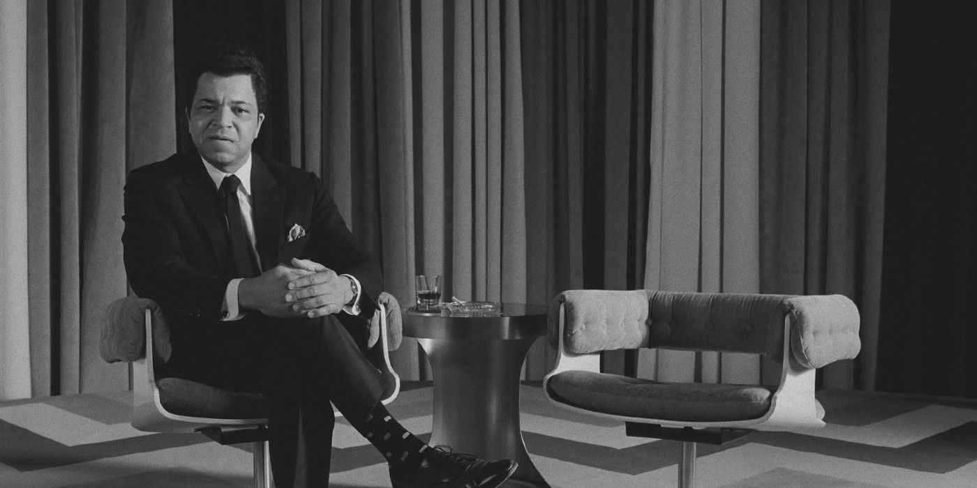
The aspect ratio changes in The French Dispatch aren’t necessarily unique considering Anderson has done it in other films (like The Grand Budapest Hotel, used to point out the changing time periods). In The French Dispatch, however, the aspect ratios are used for different reasons. The film is largely shot in the Academy 1.37:1 aspect ratio. Speaking with Kodak.com, cinematographer Robert Yeoman said it was because this particular aspect ratio was “used in many of the French films that inspired” him and Anderson; it also helped to “enhance the feeling of the time” they wanted viewers to sense while watching. Meanwhile, the Anamorphic 2.39:1 aspect ratio was employed on occasion to give The French Dispatch a bold, dynamic look. It’s likely why it’s used minimally every once in a while, with the film largely keeping to its 1.37:1 ratio.
Both the changing color and aspect ratios are meant to evoke a classic filmmaking aesthetic, which is apt considering The French Dispatch’s setting and the fictional history component of its storytelling. After all, this is a film that is set in the past and goes back even further to highlight stories that have already been written by the publication’s journalists. Between the color palette and the aspect ratio, Anderson certainly succeeds in making The French Dispatch a distinguishable film.