As much as the Krakoan era has been a high point for X-Men stories, it has also given readers plenty of Omega-level art, including some truly stunning covers. Iconic artists and newly introduced talents alike fully embraced the era’s creative freedom, resulting in some of the X-franchise’s most memorable images.
The Krakoan era unified mutantkind, allowing for new conflicts to arise, as well as fresh takes on old characters, including some of the franchise’s most notorious visions. The era takes its name from the mutant island of Krakoa, which in X-lore became a flourishing mutant nationstate. In addition to a shared narrative, X-books of this era have come to be known for a shared aesthetic, with series’ logos and trade dresses primarily created by graphic designer Tom Muller. At the same time, different artists across different titles were given great leeway to produce a wide range of brilliant, dynamic covers.
Related
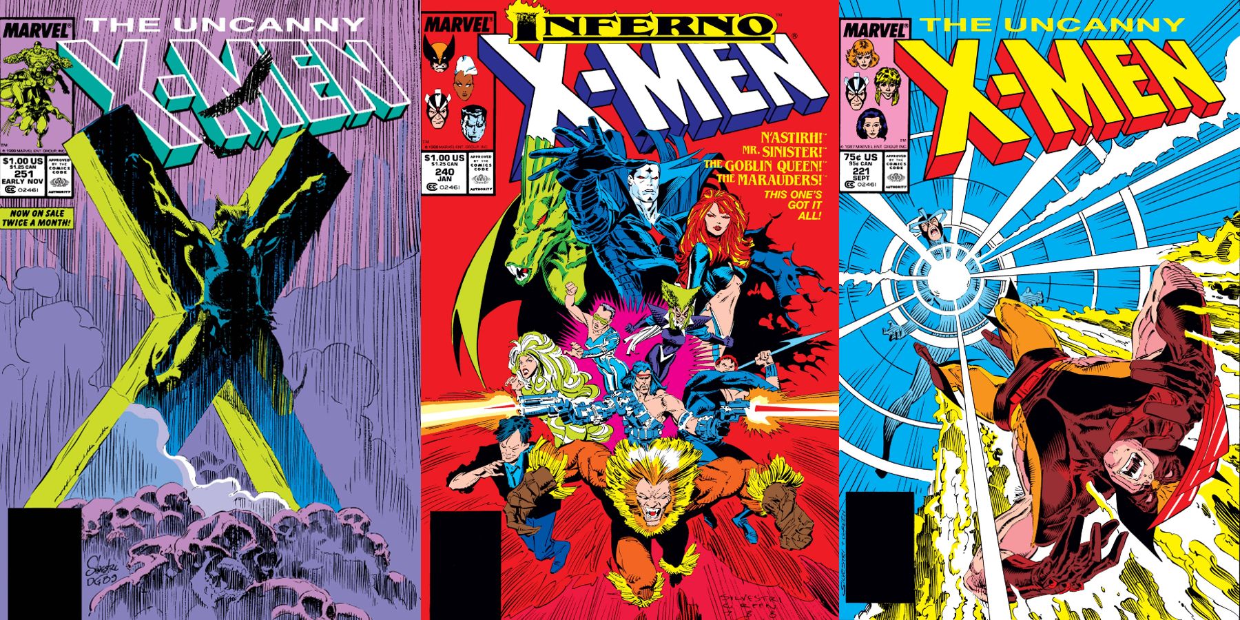
10 Eye-Catching Marc Silvestri Uncanny X-Men Covers (Ranked)
Marc Silvestri created stunning covers for Chris Claremont’s Uncanny X-Men during the late 1980s; these 10 stand out as the best of a terrific bunch.
16
An Iconic Illustrator Struts His Stuff With Krakoa’s Introduction
House of X #1 – Cover By Pepe Larraz & Marte Garcia
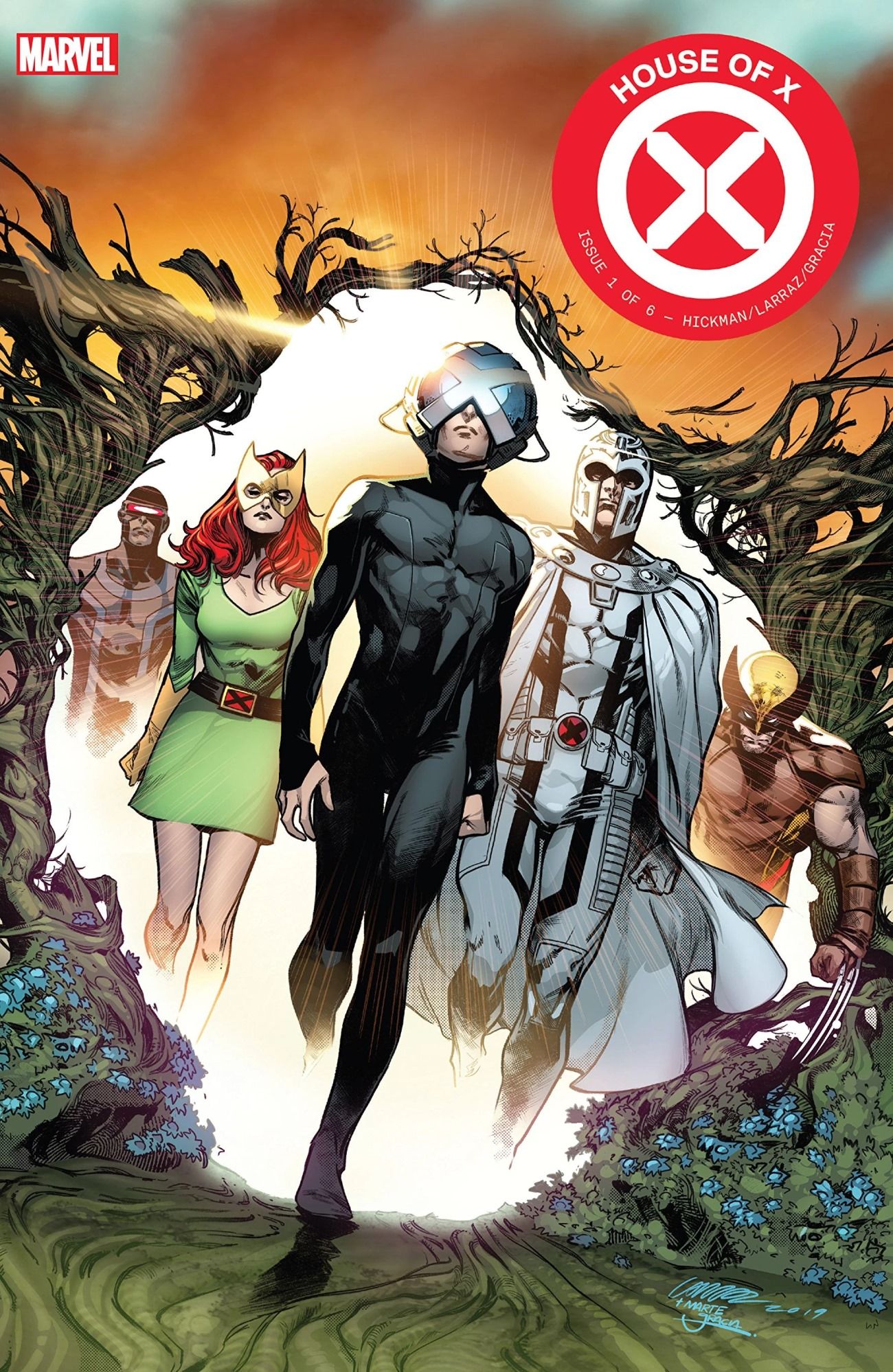
As much as the scope and ambition of Jonathan Hickman’s story defined the Krakoan era of X-Men storytelling, artist Pepe Larraz’s work ushered in its visual style. This began with the very first image of the era, the cover to House of X #1, which featured Xavier confidently emerging through a Krakoan Gate, followed by Magneto, Wolverine, Jean Grey, and Cyclops. The cover’s mix of familiar X–iconography and tantalizing new imagery perfectly encapsulated what House of X, and ultimately the Krakoan era as a whole, would offer to X-Men readers.
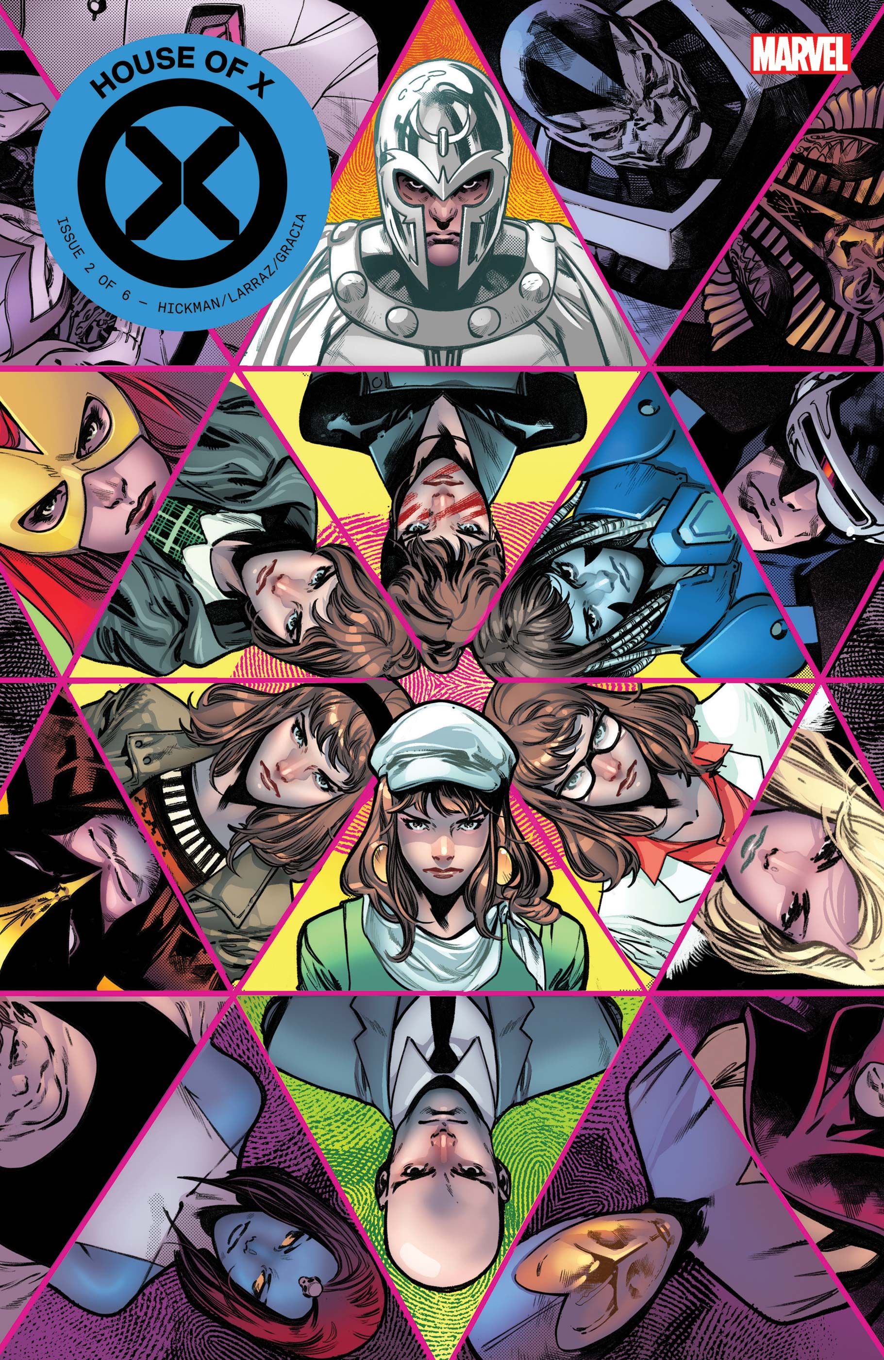
15
A Gorgeous Character Showcase From A Superstar Artist
Marauders (Vol. 1) #25 – Cover By Russell Dauterman & Matthew Wilson
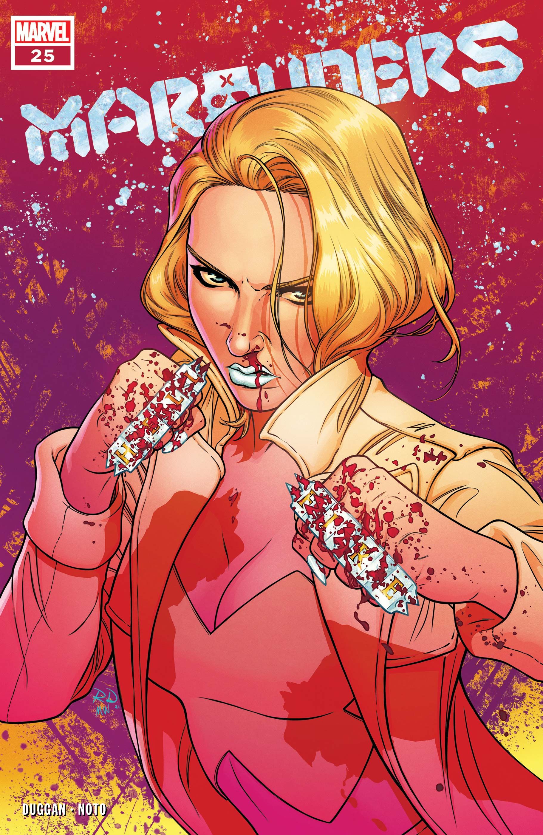
Russell Dauterman’s character portraits have been revelatory for comics, and this image of an exquisitely rendered Emma Frost is one of his best. His figures are always so clean and precise; which in this case, contrasts perfectly with Emma being bloodied, and set against a deliberately chaotic background. Matthew Wilson also shines here with his use of color, using bright, hot tones to give the cover a visual punch in the face to match Emma’s own pose. Wilson also uses the highlights of bright, blue-white diamond to contrast these tones, a visual signifier for Emma Frost that looks incredible.
14
A Mix Of Classic Sci-Fi & Krakoan Design
New Mutants (2019) #1 – Cover By Rod Reis
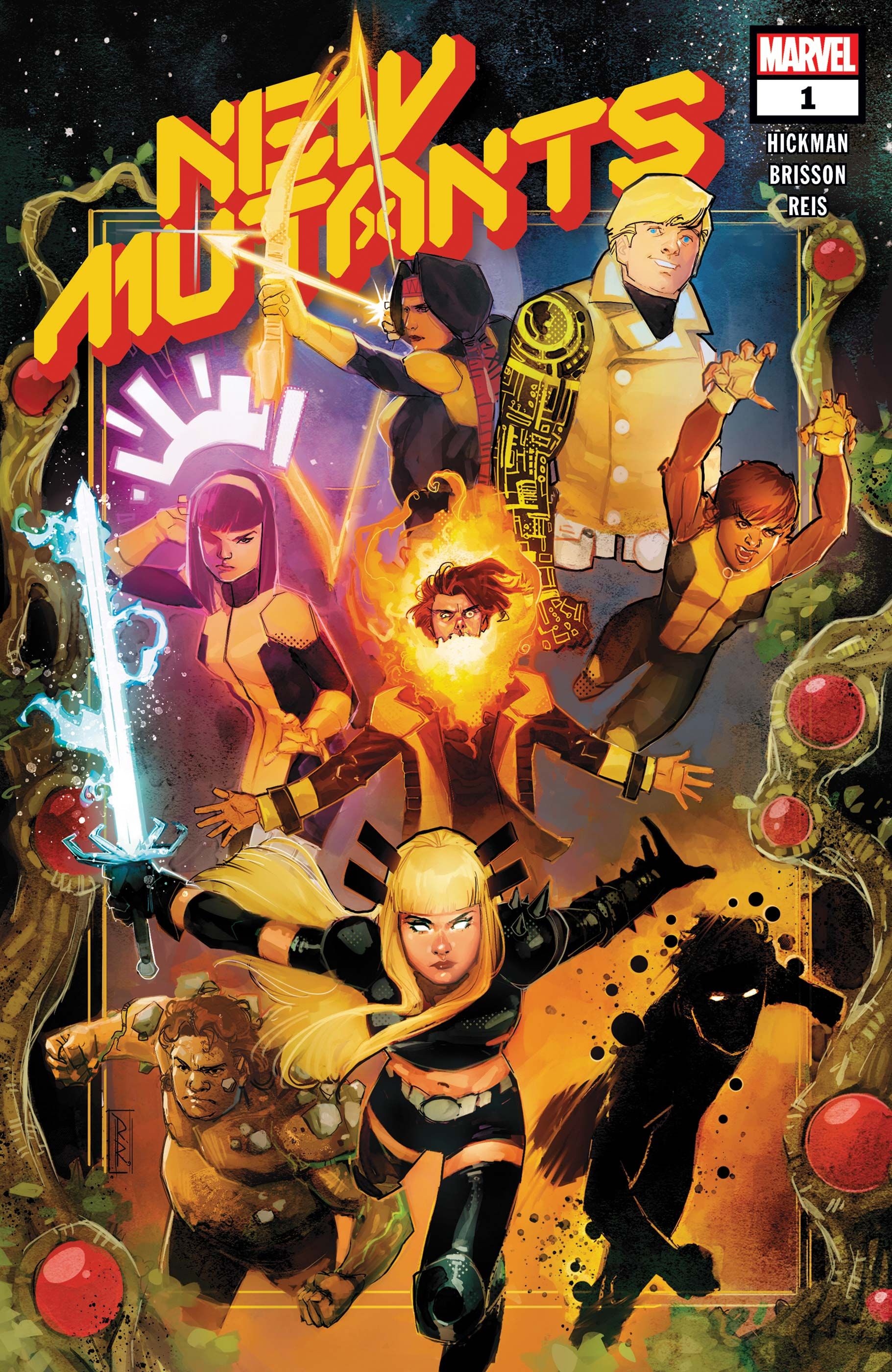
Krakoa’s iconography is a major strength of the era, and Rod Reis shows exactly how to use it to its fullest effect by bordering New Mutants #1’s cover with a Krakoan Gate. Reis’ skills are on full display, with his chunky lines intermingling with visual effects both subtle and bold, from Mondo’s muddy shading to the Bill Sienkiewicz-esque fire emanating from Chamber’s maw. Tom Muller’s off-center logo is also perfect for this story. It’s similarly bold and sci-fi, with its bright red and yellow color bringing to mind classic pulp space opera befitting this space-faring adventure.
13
How To Make A Cover Weird In All The Right Ways
X-Men (Vol. 5) #4 – Cover By Leinil Francis Yu & Sunny Gho
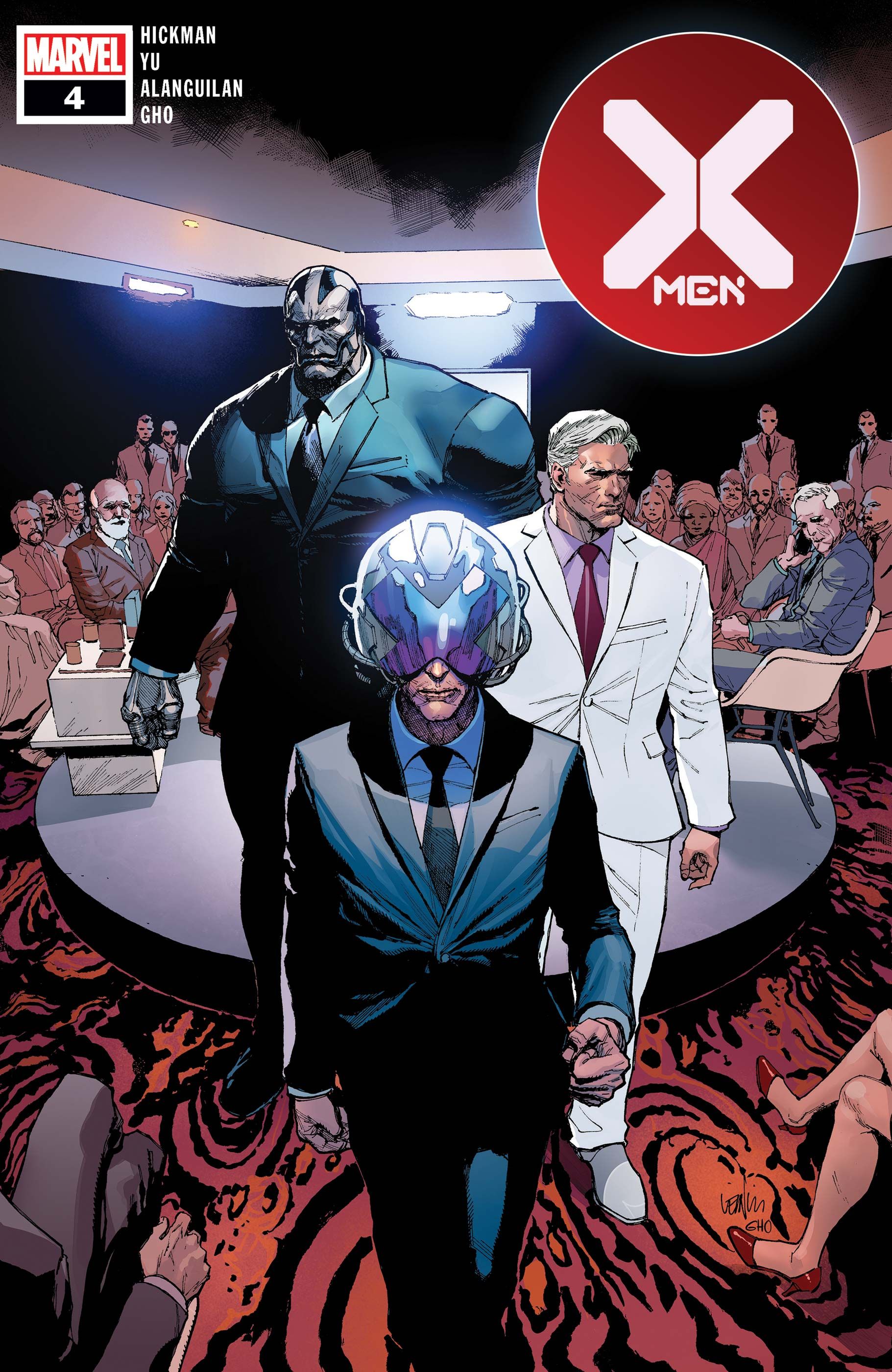
The image of Xavier, Magneto and Apocalypse in suits on X-Men #4’s cover is disconcerting, funny and instantly memorable, all in one. It immediately sets the issue apart from usual superhero fare, and also captures the dynamics at play within the issue. The mutants’ dress both aligns and contrasts them with humanity’s own elite, illustrating the inherent tensions of a ‘mutant nation’. As Magneto says in the comic, Krakoa, as an institution, is playing the same economic and political game as humanity, but the mutant nation is just doing it better.
12
11
A Surprise Encounter With A Horror Icon Stands Heads Above The Rest
X-Men (Vol. 6) #4 – Cover By Pepe Larraz & Marte Garcia
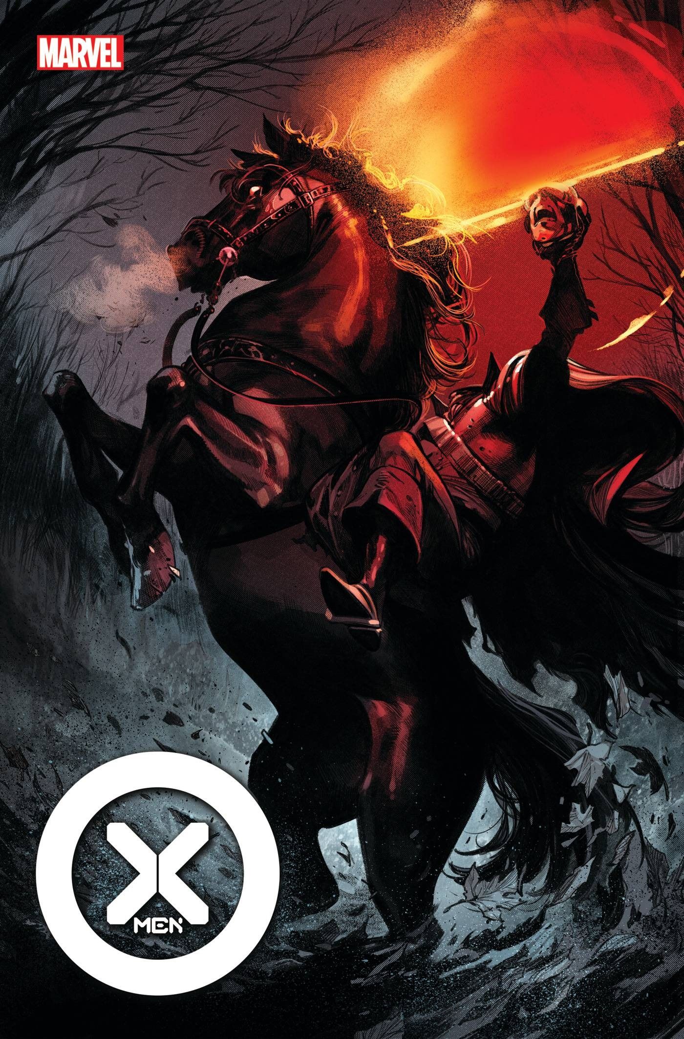
Pepe Larraz provided some of the most incredible visuals of the Krakoan era. His Headless Horseman cover for 2021’s X-Men #4, is unquestionably one of the most eye-catching. It featurees the horseman’s black steed rearing back on its hind legs, steam billowing from its nostrils, as the Horseman raises his disembodied head aloft toward a patch of blood-red sky. This Horseman cover is an engaging artistic deviation from the usual depiction of the X-Men, though it is stylistically in line with the rest of Larraz’s work on the Krakoan X-books, and it ultimately proved to be one of his most satisfying portraits.
10
Color & Contrast Make For An Unforgettable Cover
X-Men Red (Vol. 2) #4 – Cover By Russell Dauterman & Matthew Wilson
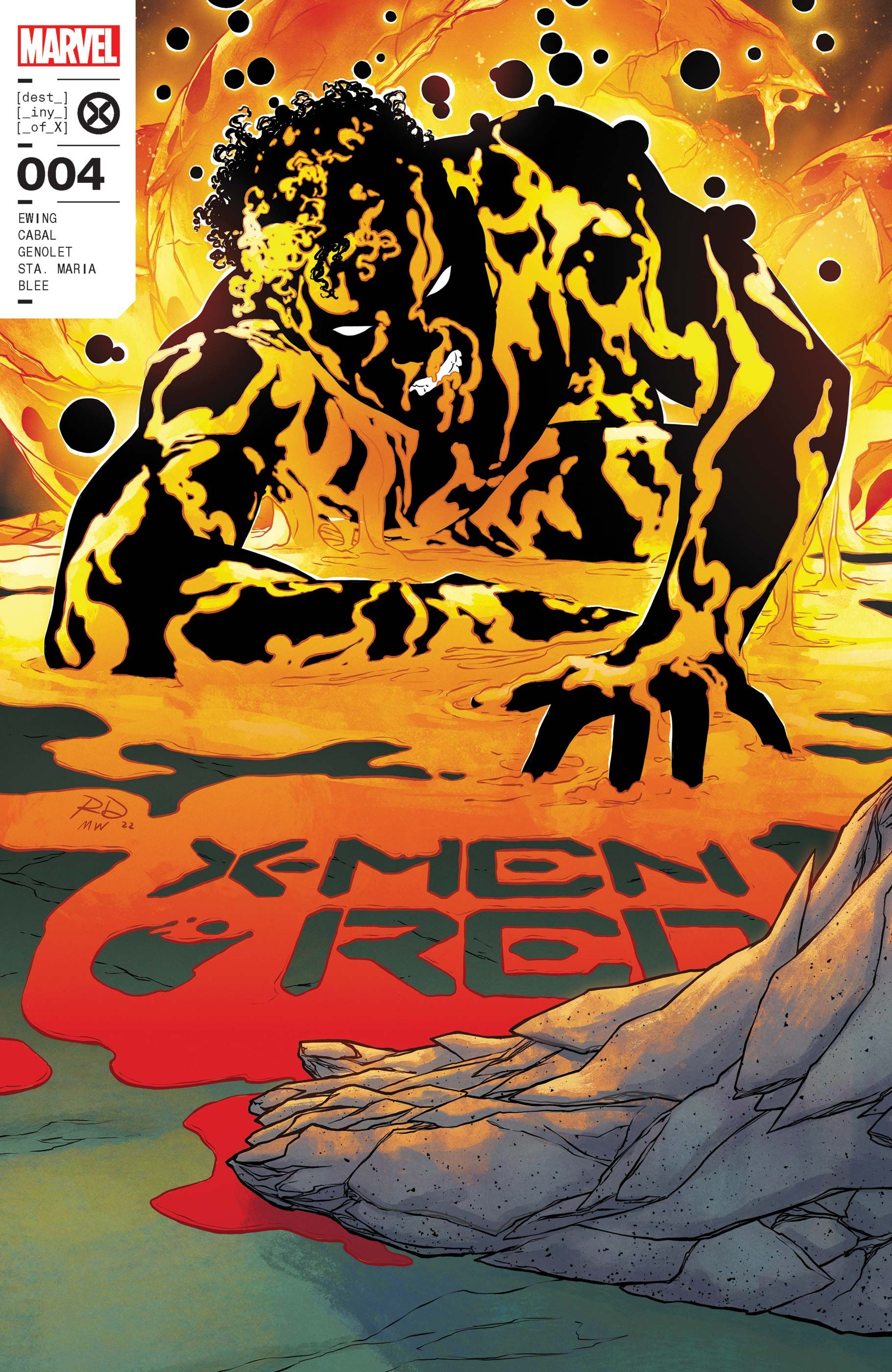
The genius of X-Men Red #4’s cover is how it plays with both color and Sunspot’s powers. At first glance, it looks like the lava-esque globules are an extension of Sunspot’s powers, but all this color is actually coming from the the Krakoan resurrection egg. Sunspot’s solid black coloring and white outline creates a stark contrast to these tones, and it’s a testament to Dauterman and Wilson that Sunspot is still the clear focus of the cover. The pièce de resistance here is the series logo, a stencil-esque cutout in the goop that blends trade dress with the cover image itself.
9
A Stunning Visual Display Of Mutant Powers
X-Factor (2020) #5 – Cover By Ivan Shavrin
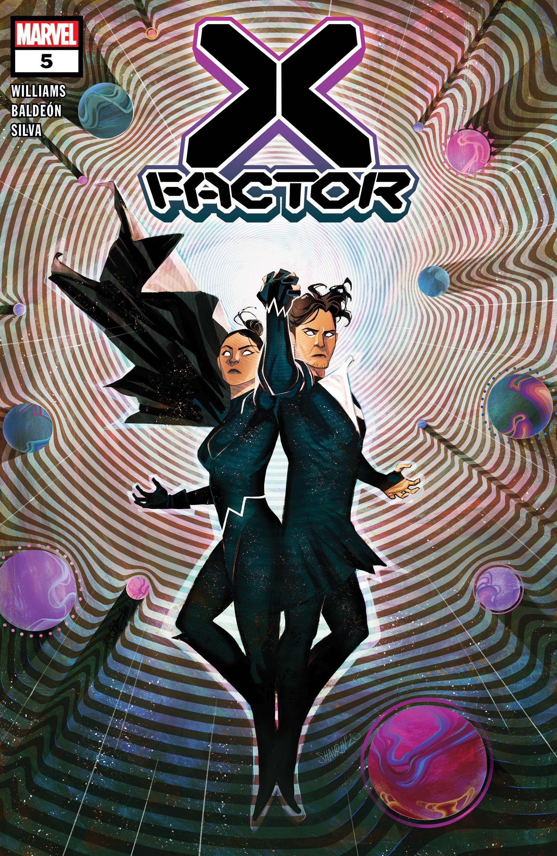
Ivan Shavrin’s X-Factor #5 cover captures the wonder of the issue’s emotional climax with an awe-inspiring depiction of mutant abilities. Shavrin recreates the moment in X-Factor #5 the Baubier twins finally reconnect, with Northstar boosting Aurora’s power to create her namesake across the Krakoan sky. Here, the black of the twins’ costumes becomes the backdrop of the starry sky itself, with the concentric waves of light emanating from the twins drawing the reader’s eye to their figures. Meanwhile, that same light bends off planets, making them look almost like bullets hurtling towards the heroes, giving the cover a 3D-effect.
Related
The 11 Best Covers From Grant Morrison’s New X-Men Run (Ranked)
Grant Morrison’s New X-Men changed the franchise forever; these 11 covers, featuring characters old and new, are the best of this amazing run.
8
The Best Krakoan Era Covers Tell Their Own Stories
Marauders (Vol. 1) #12 – Cover By Russell Dauterman & Matthew Wilson
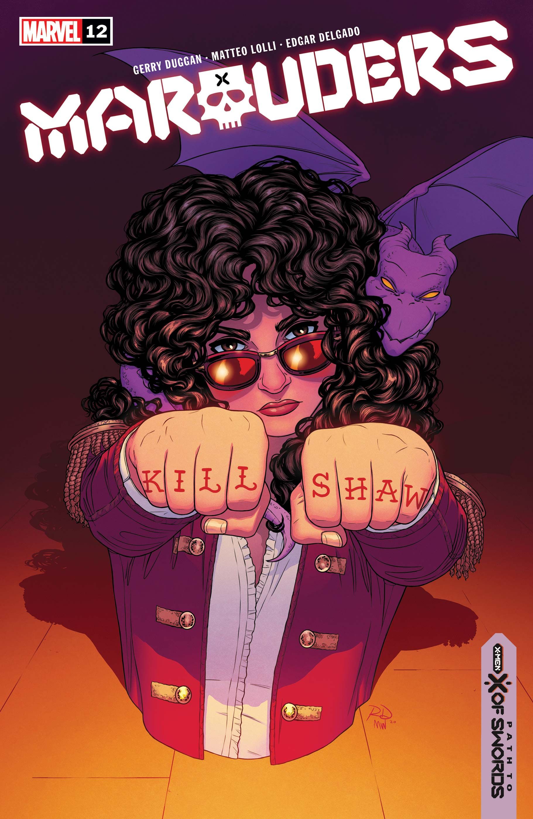
One of the key strengths of Marauders’ covers is that they often tell the story of the characters’ evolution, and Marauders #12 is a terrific example. The cover mirrors Dauterman’s earlier variant cover for Marauders #1, which featured a straight-haired Kate Pryde before she regained her natural curls. A viewer can pick up so much about Kate’s evolution with just a simple compare and contrast, not to mention that it’s a gorgeous portrait even without this context. Covers should be part of a comics’ storytelling, and Dauterman shows how to do that time and time again on Marauders.
7
Doug Ramsey’s Finest Moment Comes Right Before The Fall
Immortal X-Men #13 – Cover By Mark Brooks
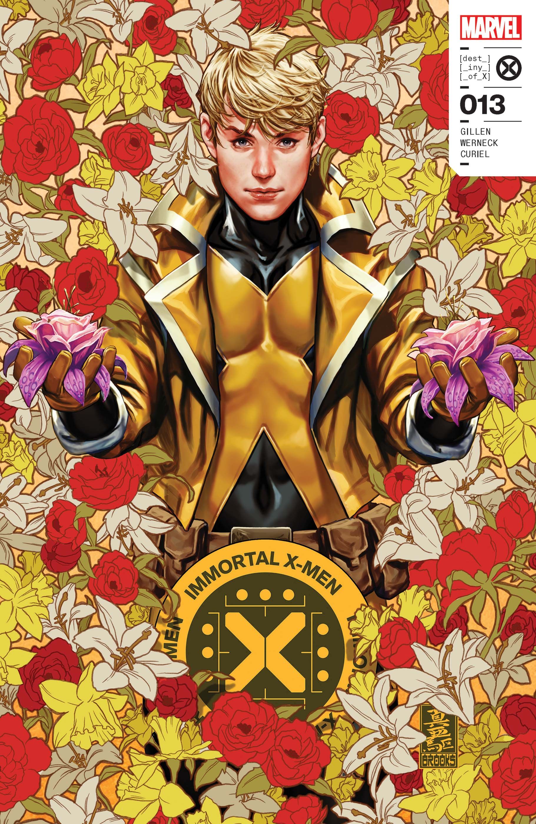
Mark Brooks’ Immortal X-Men #13 for is one of the best images of Doug Ramsey ever, depicting him as positively radiant, surrounded by Krakoan flora. In the issue, the living island Krakoa moves into the season of fallm to symbolize the approaching Fall of X, and Brooks’ cover subtly conveys this idea. While it’s still bright, the cover also has brassier, autumnal tones to emphasize the change in Krakoa, especially in the brown outlines of each flower. It’s the use of color as storytelling and theme that elevates this cover above so many others.
6
An Unmatched Mastery Of Visual Design
X-Corp #1 – Cover by David Aja
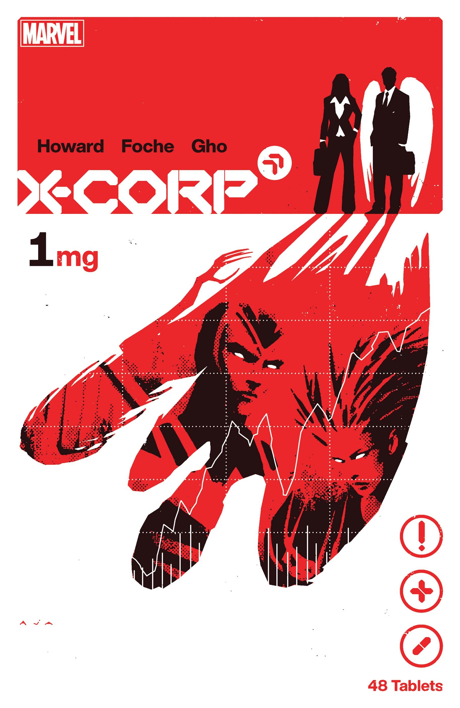
David Aja proves he’s among the best in the business with a cover that looks like a movie poster and a box of medication at the same time. The negative space of the white border accentuates the rounded corners of what would, on another cover, be the edge of the image. By adding the border, the cover itself looks even more like an in-universe object, only enhanced by its faux labels. Aja’s design is also in conversation with Tom Muller, neatly replicating the style of shapes and lines that Muller has used to define the Krakoan aesthetic in his logos.
5
Color & Shape Working Together In Harmony
House of X #4 – Cover By Pepe Larraz & Marte Gracia
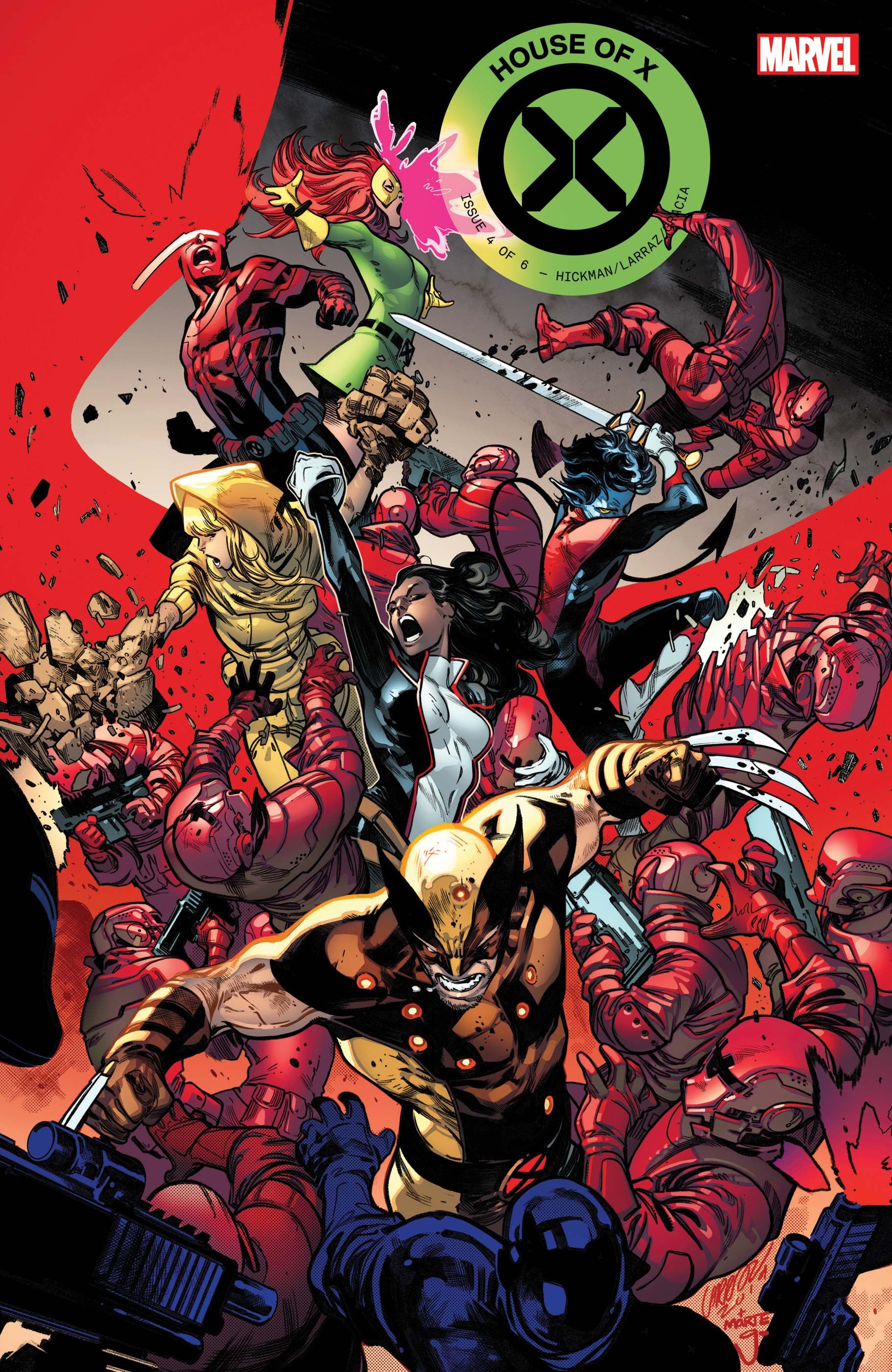
Marte Gracia’s use of bold colors in House of X/Powers of X is revelatory, and there’s no better example than his work on Pepe Larraz’s House of X #4 cover. Here, the bright red of Cyclops’ optic blast is set against the similarly bold green of the series’ logo and Jean Grey’s dress. This effect works so well because the cover also uses shape to its advantage. The curve of the optic beam orbits the green without touching it, giving the dress and logo its own clean corner of the image to stand out without being overpowered by the red.
4
A Cover Filled With Symbolism
X-Men (Vol. 5) #7 – Cover By Leinil Francis Yu & Sunny Gho
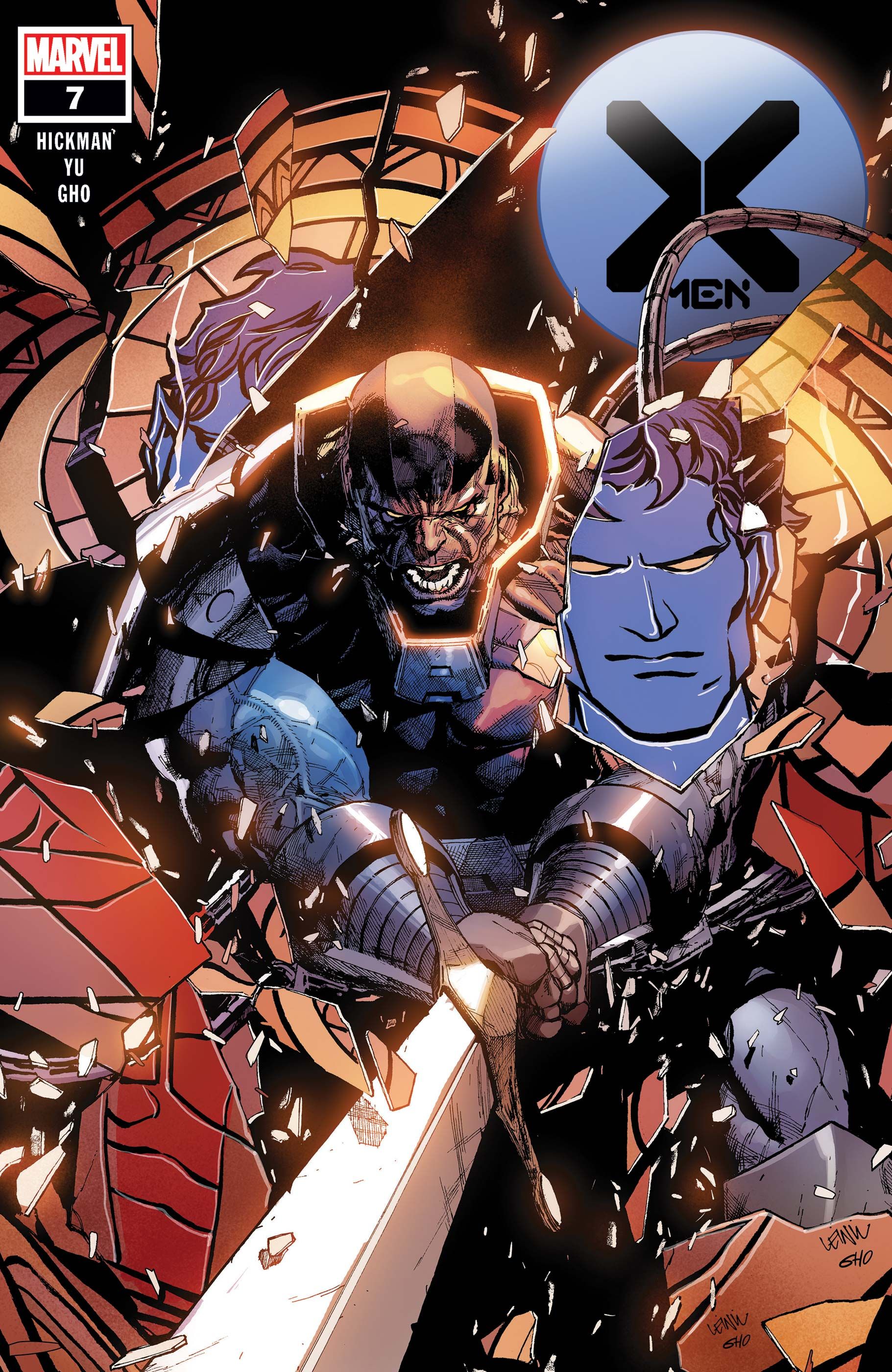
This cover is not only is this cover an all-time image of Apocalypse, but it’s also charged with so much symbolism. Apocalypse’s philosophy, and what the establishment of his gladiatorial Crucible says about Krakoa, is shattering Nightcrawler’s faith like the cover’s stained-glass window. While the light source isn’t clear, the reflections and shadow on Apocalypse’s face also perfectly complements Yu’s sketchy style. This neatly contrasts with how cleanly Nightcrawler is rendered, which only further symbolizes how Kurt’s straightforward, ‘clean’, moral code is being challenged by what Apocalypse has established on Krakoa.
3
A Wraparound Cover Hinting At The Story To Come
Immortal X-Men #1 – Cover by Mark Brooks
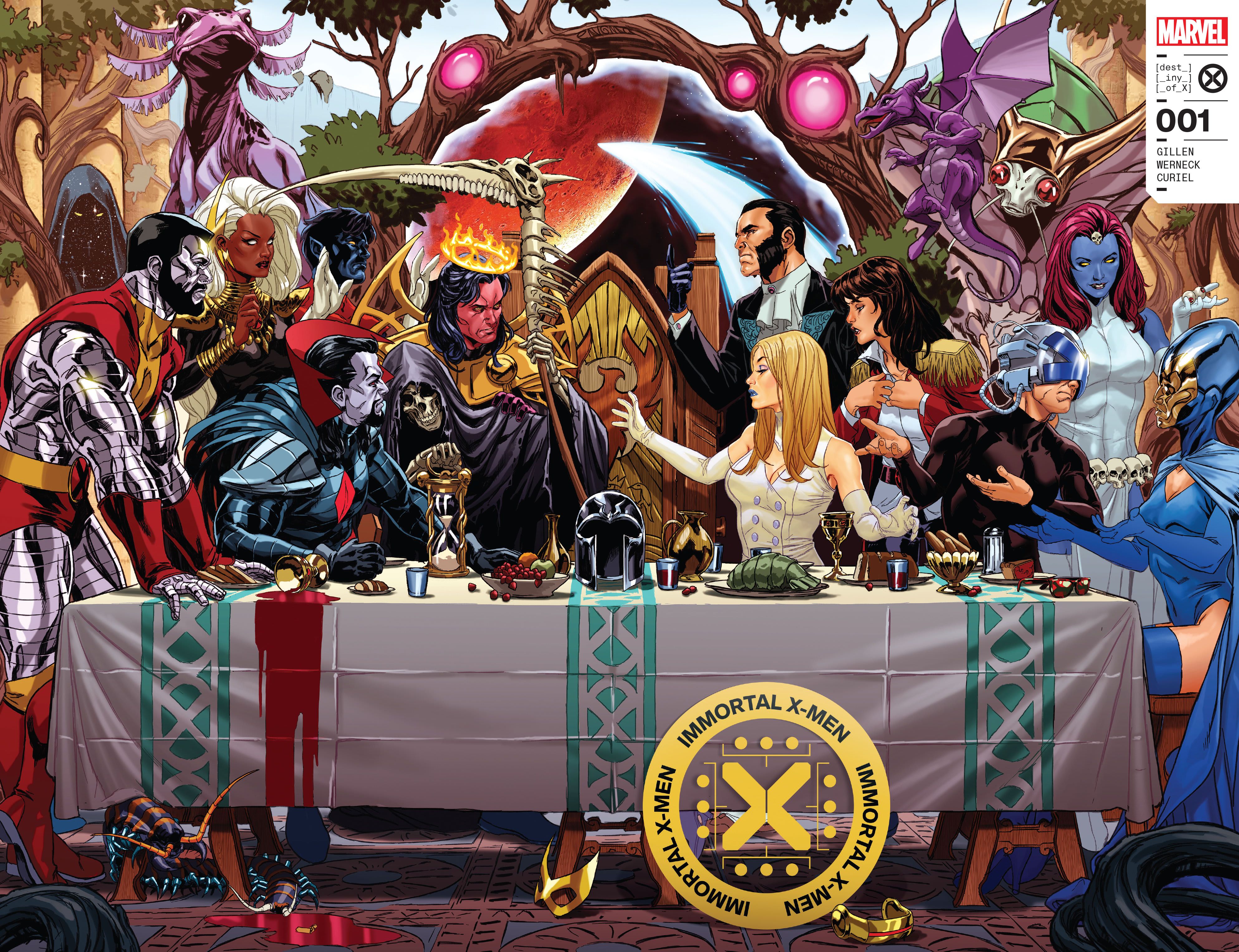
Mark Brooks’ spectacular wraparound cover to the first issue of Immortal X-Men recreates Leonardo Da Vinci’s The Last Supper with the X-Men’s Quiet Council. This reference not only sets the stage for the bickering and conflict of the series, but also uses the biblical allusion to hint at the disaster to come. This is the X-Men’s metaphorical last supper as well. This reference is only possible thanks to Brooks also using the issue’s back cover, and getting to see an artist play with the full potential of a landscape image is supremely gratifying.
2
A Stunning Kaleidoscope Of Possibilities
House of X #2 – Cover By Pepe Larraz & Marte Gracia
House of X #2’s cover might be the most memorable of the entire Krakoan era for its use of shape. Here, Moira MacTaggert’s different lives are split apart as the centerpiece in a kaleidoscopic image that also shows the characters central to the issue’s story and Moira’s life as it expands. It’s an ingenious visual metaphor for Moira’s power of reincarnation. Each new life she leads splits the timeline like this fractal image. It also signifies Moira’s centrality to this era of the X-Men, with everything emanating outwards from her decisions and plans.
1
The X-Men’s Mind-Blowing Sci-Fi Future Comes To Life
Powers of X #1 – Cover By R.B. Silva & Marte Gracia
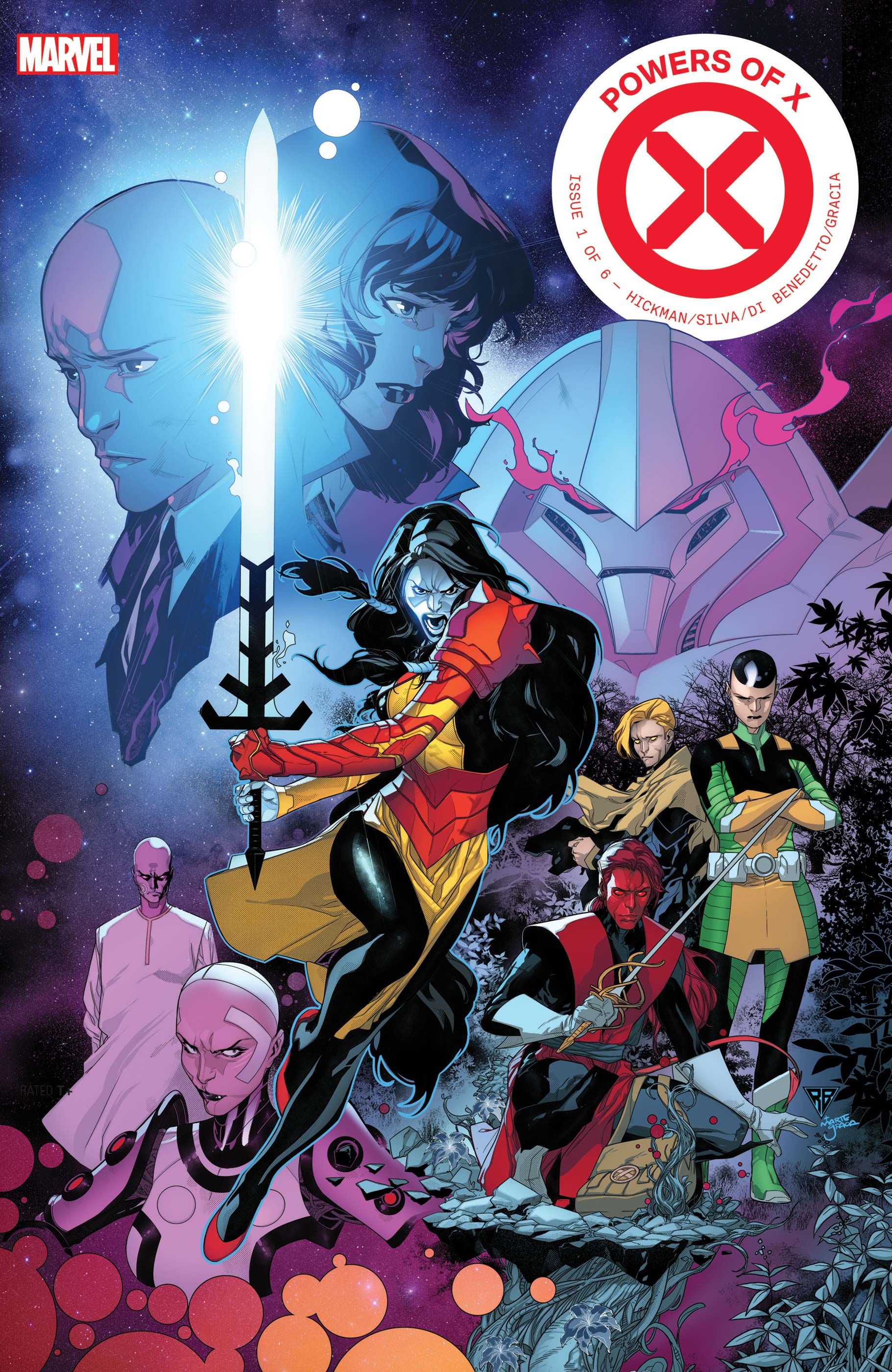
Powers of X made a superstar out of R.B. Silva, and the cover to its first issue announces that status immediately. It is the perfect representation of the sci-fi weirdness of Powers of X, chock-full of visual flair. Again, Marte Gracia is on fire with his colors, with the bright blues of the top left corner transitioning into weird pinks and purples. Like many Krakoan books, flora is also crucial to this cover, with natural plant-life contrasting to the inhuman future that A.I.s have built in Powers. In this sense, it is the X-Men as sci-fi like readers had never seen before.