Grant Morrison’s New X-Men run is one of the most important X-Men series ever published by Marvel Comics – and these eleven covers are the highlights of the entire run. Morrison’s series began in 2001, following a critically rough time for the X-Books. As the writer of New X-Men, Morrison brought the franchise into the 21st century.
Morrison’s stories emphasize evolution in a variety of ways: progression in the X-Men’s ethos, the introduction of secondary mutations for classic characters, the further development of mutant culture, or the X-Men film-new aesthetic, much of it designed by artist Frank Quitely. This New X-Men run is still talked about decades later, and the art is as much a part of why as Morrison’s writing; as the first thing that grabs a comic reader’s attention, covers are essential to a book’s success. The New X-Men covers below highlight the best aspects of this run, from character designs, stories, and themes, to images that just look plain cool.
11 New X-Men #129 (Cover by Igor Kordey)
Shows What The Series’ Most Underrated Artist Was Capable Of
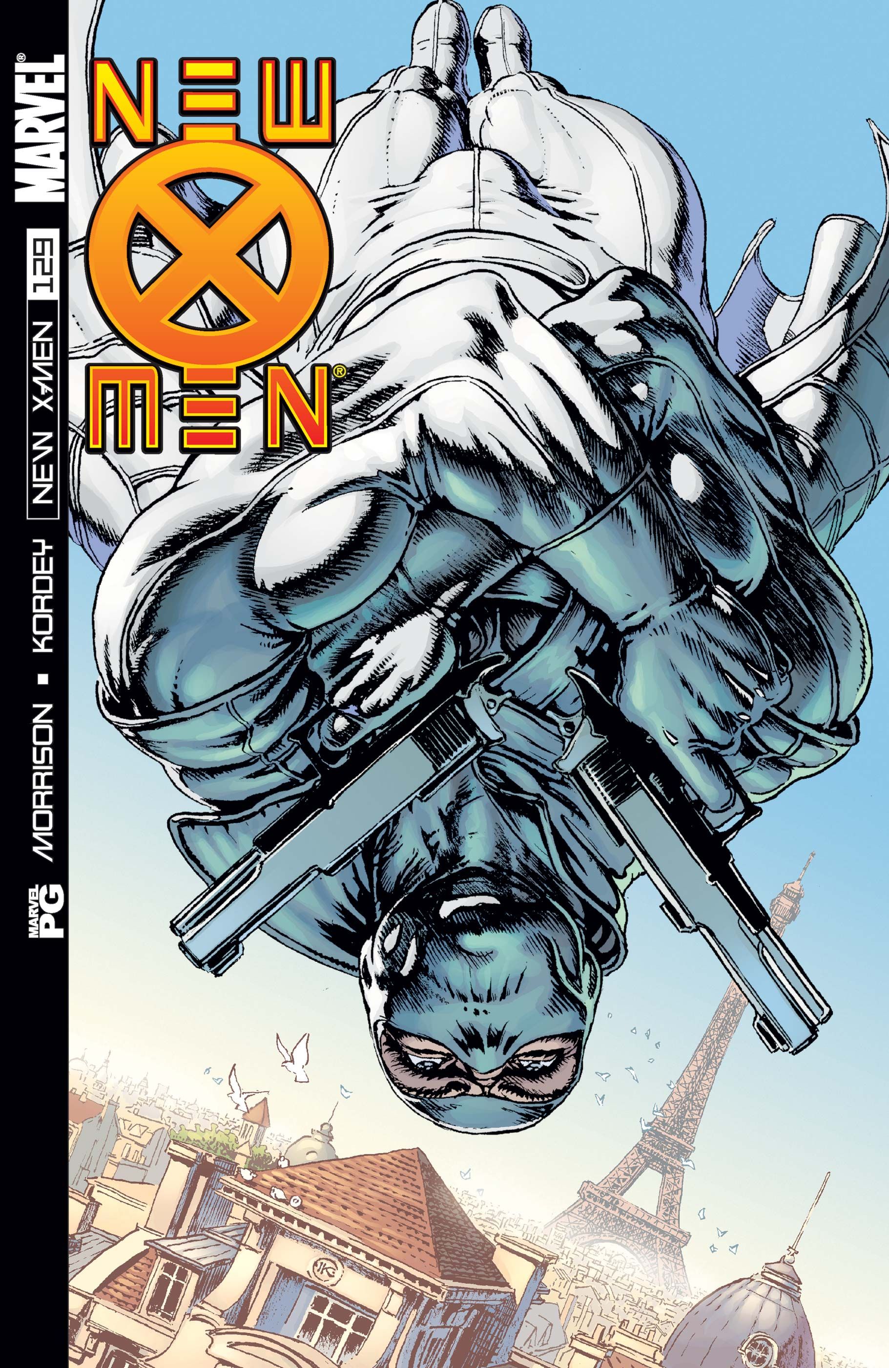
Artist Igor Kordey’s work on New X-Men was criticized for being sloppy, but his New X-Men #129 cover provides a true look at his talent. The use of perspective – as the newly introduced Fantomex drops into Paris – is fantastic, giving the viewer a unique angle, while also emphasizing the character’s musculature. This figurework is a strength of Kordey’s work in this arc, even when other aspects of his art are messier, which was only due to the short amount of time he had to illustrate his issues. This is also the first cover of many on this list featuring only a single character; a staple of Morrison’s New X-Men run.
10 New X-Men #132 (Cover by Frank Quitely)
Demonstrates How Magneto Became A Symbol For Mutantkind
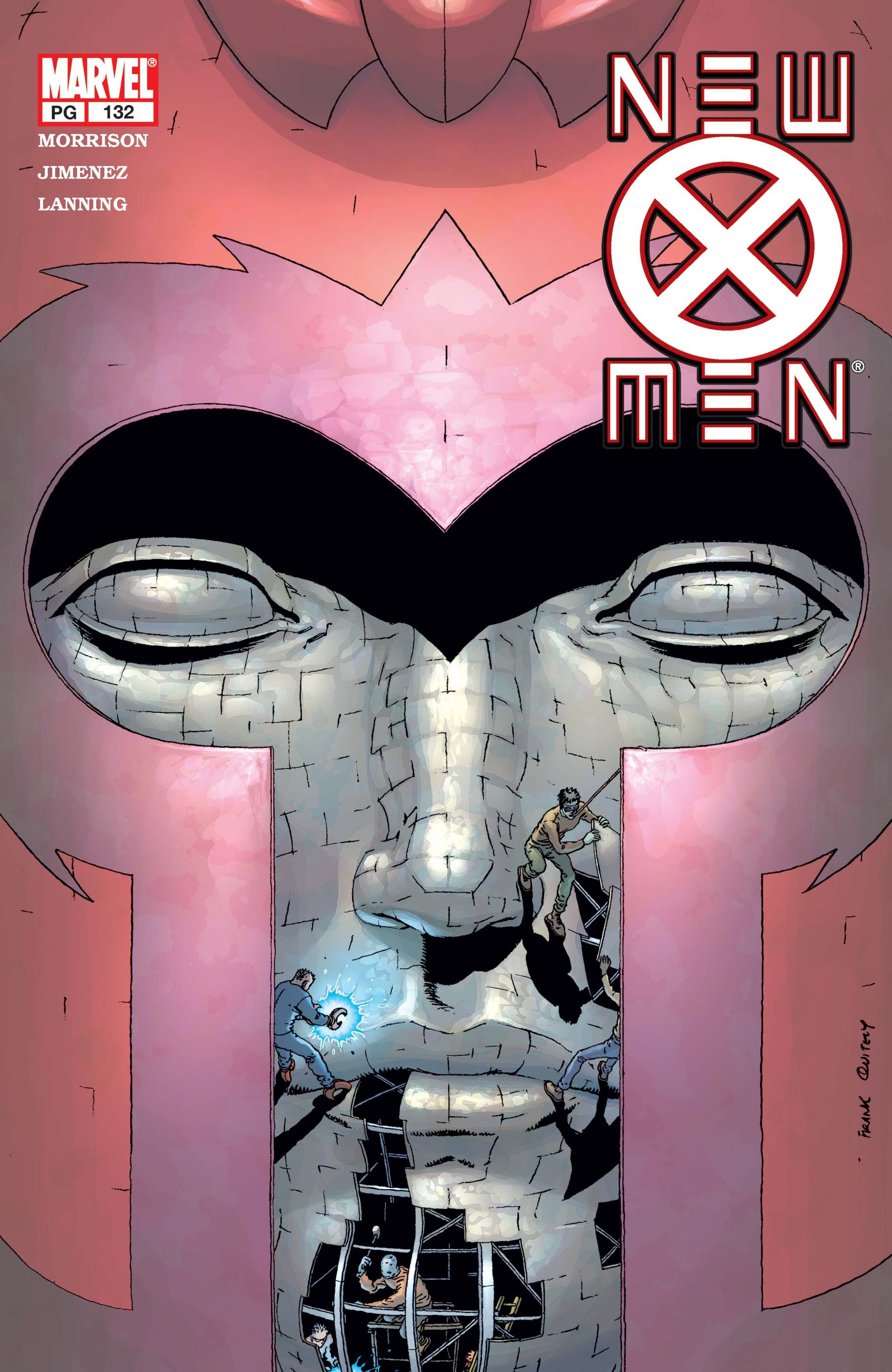
Frank Quitely’s cover for the relatively self-contained “Ambient Magnetic Fields” story features a Magneto statue being erected in the ruins of the recently destroyed Genosha. This symbolizes exactly what Magneto meant to the first half of Morrison’s New X-Men run. He had become a tragic martyr, gone too soon, and a symbol for some rebellious younger mutants. This only mde his incredible return to villainy at the end of the run an even worse of a gut-punch, as he reverted to the worst version of the character since the 1960s. Quietly’s New X-Men #132 cover demonstrates that a cover can be more than simply a cool image, that it can be part of the broader story itself.
9 New X-Men #151 (Cover by Marc Silvestri, Joe Weems and Steve Firchow)
Introduces A New X-Men Dystopia In Style
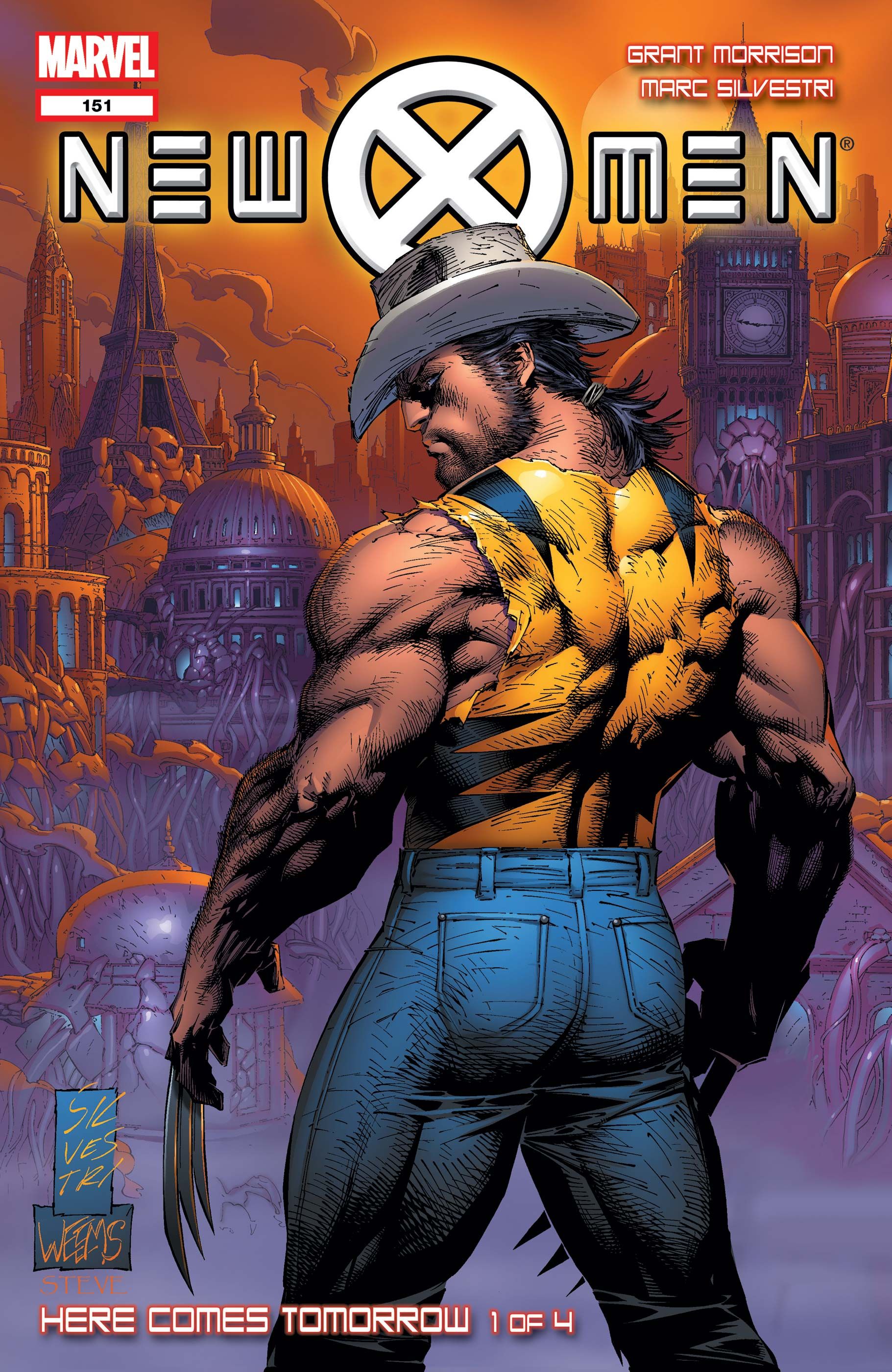
In a collaborative effort, Marc Silvestri, Joe Weems, and Steve Firchow give a stunning introduction to the dystopia of “Here Comes Tomorrow,” the final arc of Morrison’s run, with this male model-esque shot of Wolverine. Steve Firchow’s colors on this cover indicate the sci-fi tone of the story with the oranges and purples of the background, a trend that continues into the interior art. This arc’s differences from the rest of the series are also highlighted by making the series’ logo into a more traditional horizontal header, done for the first time on Silvestri’s cover for the prior issue, New X-Men #150.
8 New X-Men #141 (Cover by Phil Jiminez)
Defines Bishop For A New Era With A Classic Reference
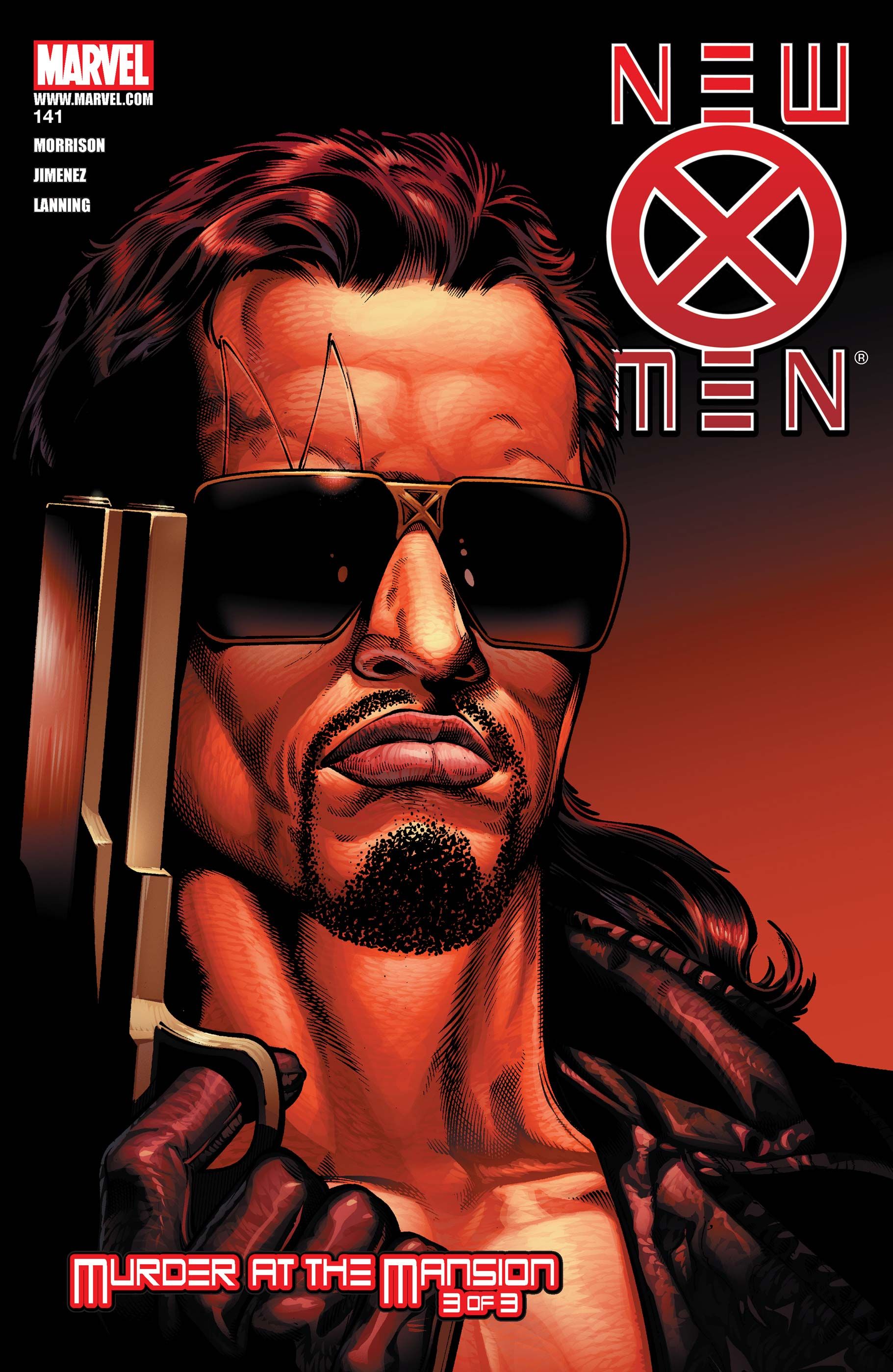
With this incredible cover, Phil Jiminez defines the look of Bishop in the early 2000s in one image. Lucas Bishop’s time as a mutant detective had already begun with David Hine’s District X when New X-Men #141 was released in May 2003. However, for many X-Men fans, it’s this image of Bishop that’s stood the test of time. With only the possible exception of Cable, Bishop was the ultimate expression of what cool looked like in ’90s comics; this cover, which imitates the poster to the original Terminator film, leans into that cool factor like little else, while also highlighting the nature of the character. Like Arnold in The Terminator, nothing can stop Bishop.
7 New X-Men #139 (Cover by Phil Jiminez)
Captures The Drama At The Heart Of Morrison’s Run
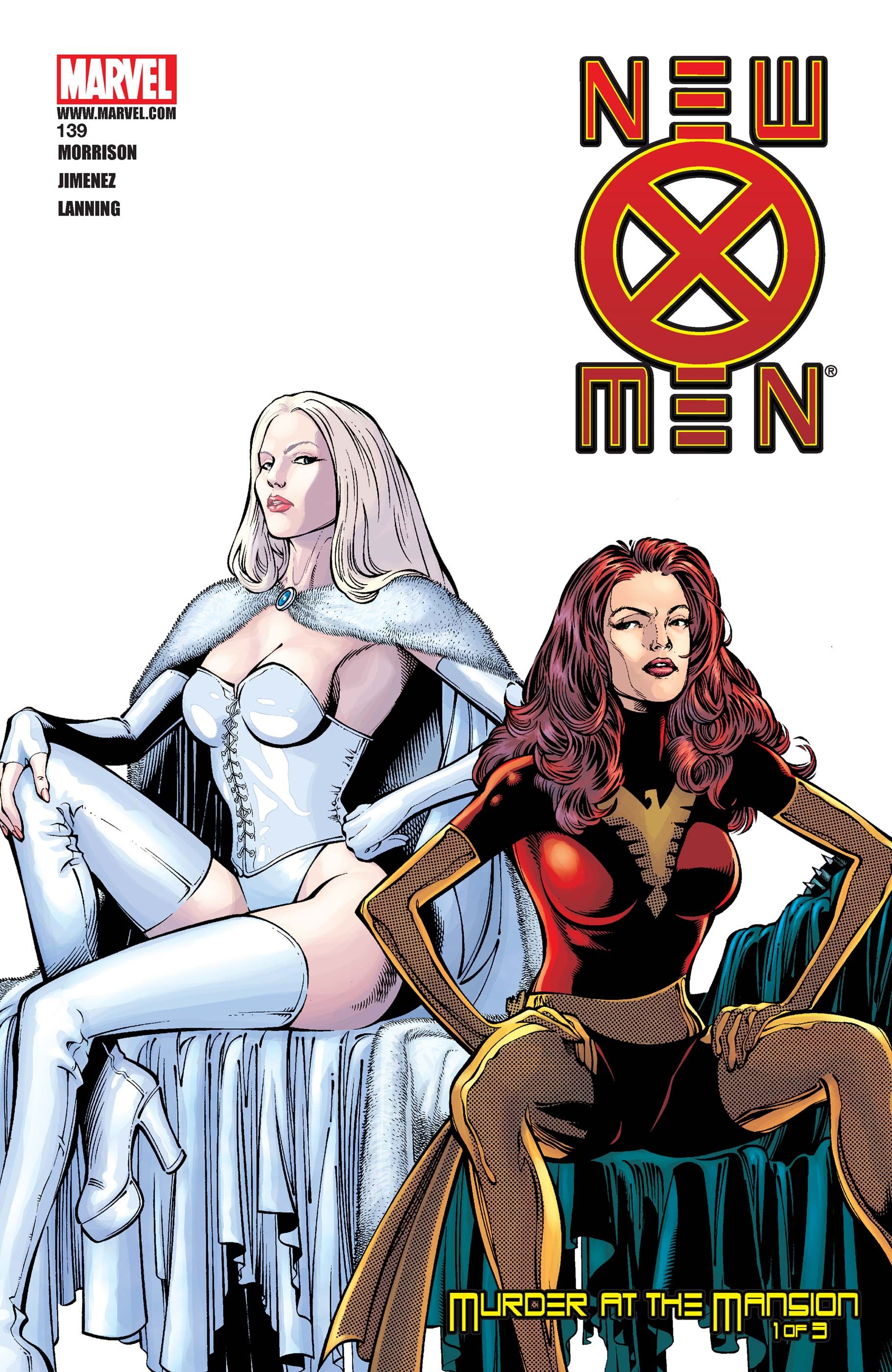
The soap opera drama between Emma Frost and Jean Grey is one of the core emotional conflicts of Morrison’s entire run. Jiminez’s cover for New X-Men #139 is an all-time image of Jean and Emma together. Featuring the two deliberately avoiding each other’s gaze, the blank space at the top half of the cover gives it a clean, elegant look, austere in its simplicity, while also making sense in the context of the issue, which is set in the mindscape where Emma has seduced Cyclops. This simplicity also serves to further highlight Jiminez’s suburb figurework, with Emma and Jean again in model-like poses.
6 New X-Men #143 (Cover by Chris Bachalo and Tim Townsend)
Fantomex Has Never Looked Better
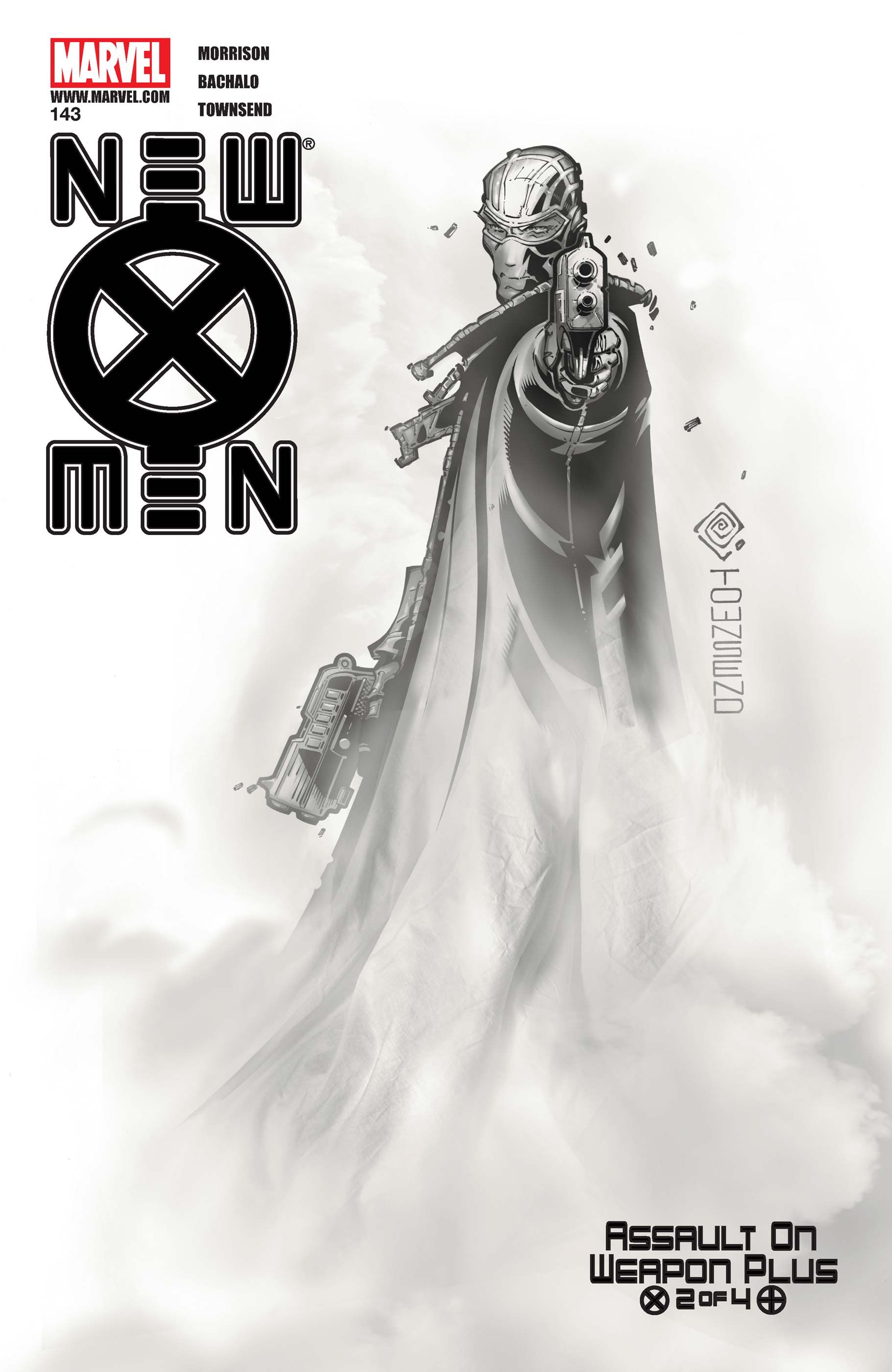
Chris Bachalo and Tim Townsend give New X-Men yet another character-defining cover with their version of Fantomex, and it’s still the best he’s ever looked. Once again, the strength of this cover is its simplicity. Fantomex’s black and white suit works amazingly in grayscale. The use of color is also notable in the issue’s interior art. New X-Men #143 sets entire panels in the yellows of the X-Men’s uniforms, or the grayscale of Fantomex’s outfit, giving the issue and arc an entirely different feel than anything else in Morrison’s run.
5 New X-Men #133 (Cover by Frank Quitely)
Introduces Dust With A bold Cover
Quitely’s cover to #133, introducing the character of Dust, is once again a great use of shape. The shape and solid black color of Dust’s niqab is visually striking, serving to emphasize Dust’s face. This cover also mirrors the Magneto statue of the issue immediately prior, New X-Men #132, which feels like a deliberate contrast, especially once Magneto goes evil, considering Dust became a major student holdout against his reign of terror at Xavier’s school. The character’s striking green eyes are the centerpiece of the image, but for readers who are attentive to detail, the cover’s treat is that Dust’s pupils are silhoutes of Wolverine.
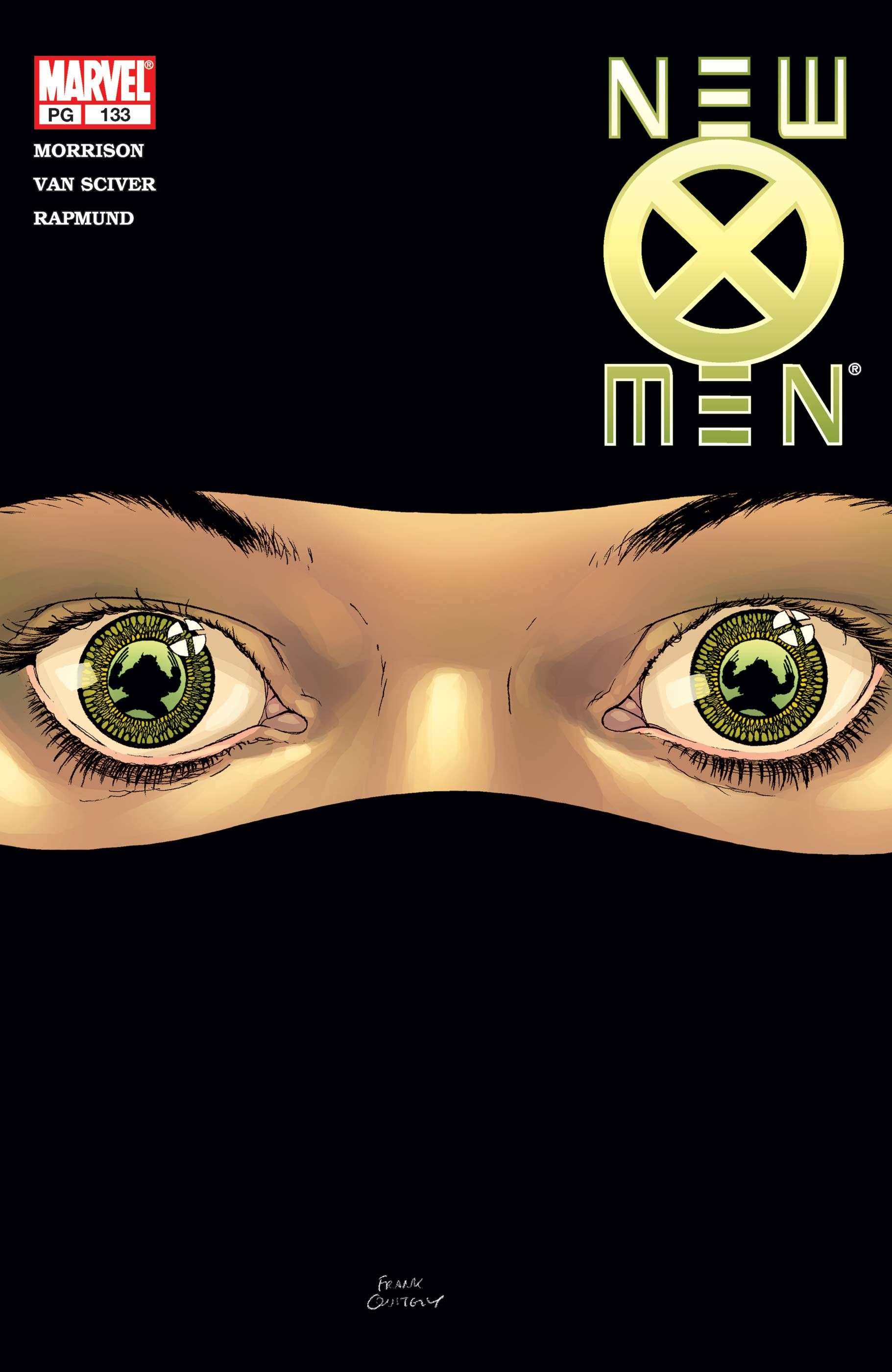
4 New X-Men #115 (Cover by Frank Quitely)
An Iconic Wolverine Image For A New Millennium
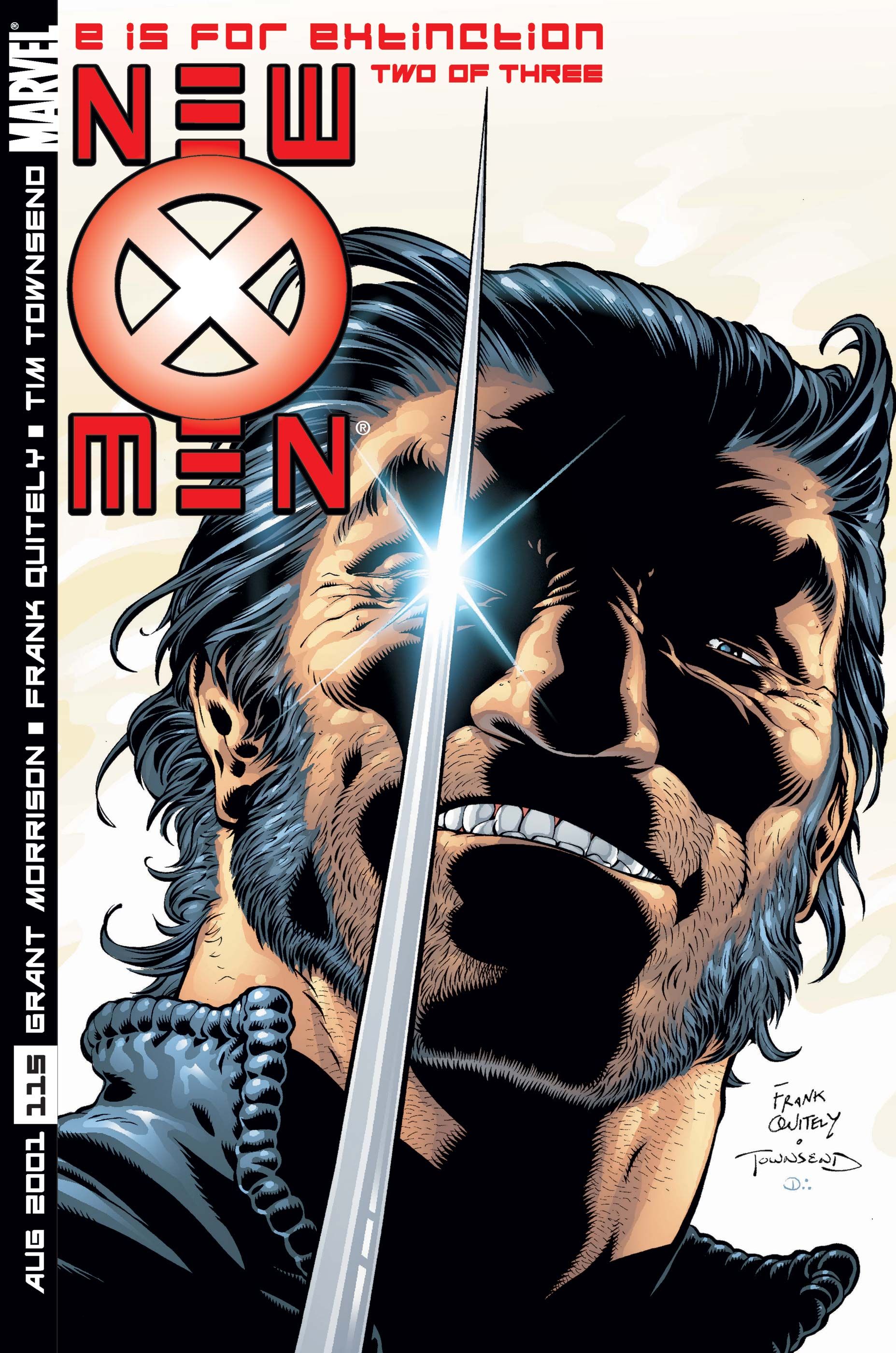
This cover is the Platonic ideal of Frank Quitely’s Wolverine and one of the defining images of Morrison’s run. With a single claw popped, Logan is depicted grinning at the viewer. While not identical, this cover is clearly influenced by Frank Miller and Josef Rubenstein’s iconic cover to Wolverine Vol 1 #1. Instead of Wolverine #1’s triple lens flares on Wolverine’s claws, Quitely instead gives Logan only one, covering his right eye, which gives the Mutant even more of an air of menace. Quietly’s New X-Men #115 cover is a masterclass in how to do a cover referencing a famous comics issue, while putting a distinct spin on it.
3 New X-Men #147 (Cover by Phil Jiminez)
Reveals Magneto’s Return As The X-Men’s Greatest Antagonist
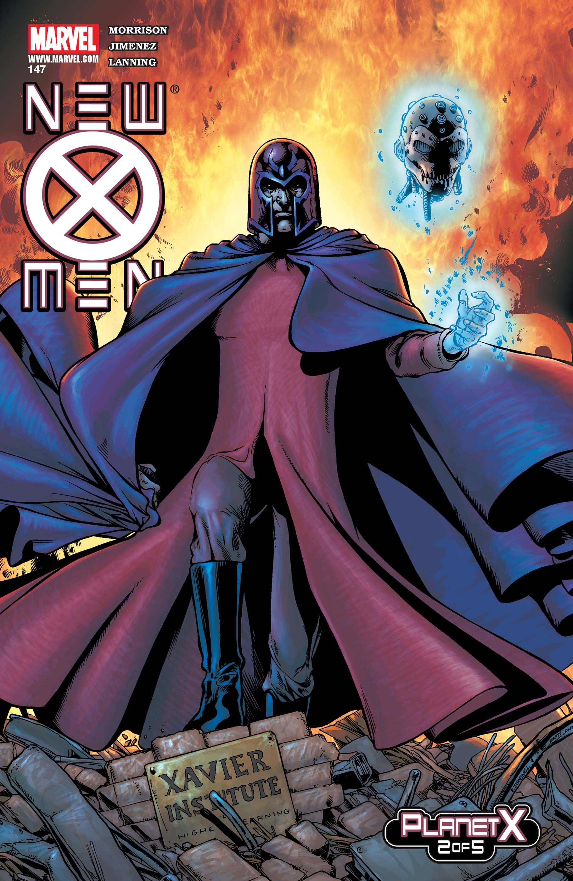
Phil Jiminez’s image of Magneto on New X-Men #147’s cover is a statement of intent for Morrison’s conception of the character. He’s not a tragic figure, but rather a tyrant standing over the burning wreckage of the Xavier School. It is also a direct counterpoint to Frank Quitely’s New X-Men #132 cover. The cover for New X-Men #132 features an imagined Magneto standing in opposition to the destruction of Genosha, while #147 shows a “real” Magneto reveling in destruction. Despite retcons establishing this wasn’t actually Magneto, this cover loses none of its power as it applies Morrison’s stunning penultimate New X-Men arc.
2 New X-Men #127 (Cover by Frank Quitely)
Encapsulates Xorn’s Story In One Image
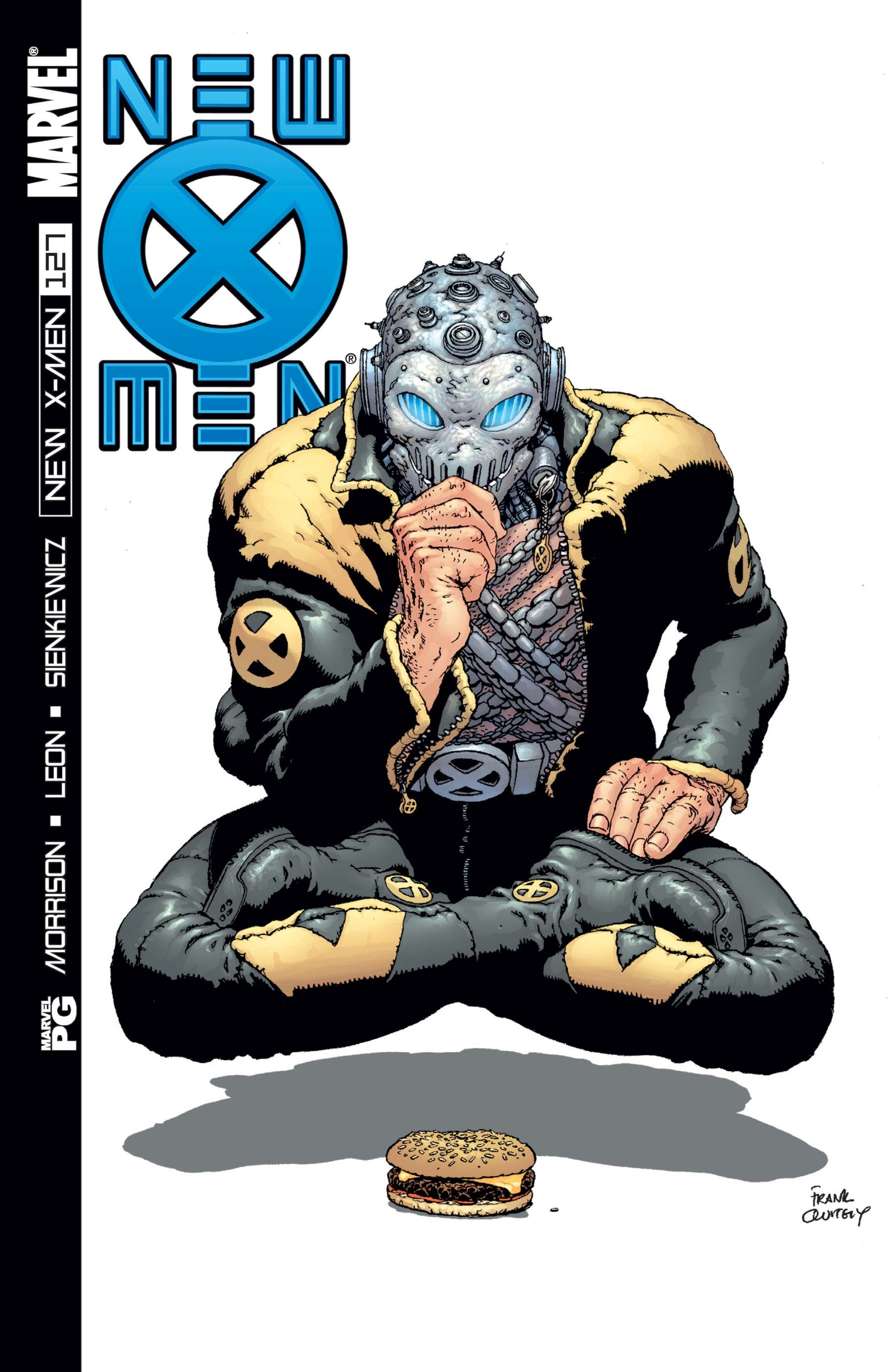
With this cover, Frank Quietly produced the definitive image of Xorn. New X-Men #127 is a one-shot, featuring Xorn narrating his exploration of New York City, with the (allegedly) Chinese mutant musing on American culture. There’s no better symbol of that culture than a hamburger. Quietly’s cover is one of New X-Men’s stand-out comedic moments, as the monastic Xorn peers at a burger. Once Xorn is revealed as Magneto, the character’s behavior appears, in retrospect, obviously performative, with Xorn being Magneto’s parody of an idealistic ‘Zen Master’ designed to specifically fool Professor X. In some ways perhaps, X-Men #127’s cover is meant to telegraph this eventual reveal with its subtle absurdity.
1 New X-Men #114 (Cover by Frank Quitely)Introduces The New X-Men To The World
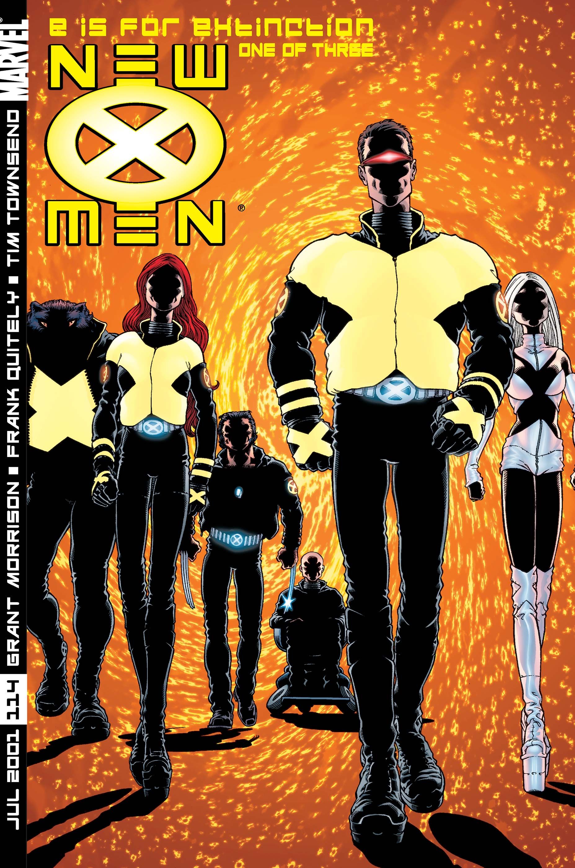
The iconic cover to the first issue of Morrison’s New X-Men is the perfect introduction to the team. Frank Quitely puts the team in shadow, still to be fully revealed, backlit with a vibrant fluorescent orange; very early-2000s, but still a great visual. This vibrancy – and the introduction of the series’ vertical logo and trade dress – is an indication that this book is going to be something completely new, even as the book retains the numbering of the immediately prior X-Men Vol 2. This cover is an iconic X-Men image; there’s a reason it’s also the cover to multiple trade paperbacks and Omnibus versions of Grant Morrison’s entire New X-Men.