Google is rolling out a freshened up visual design for Search on mobile. The aim is to simplify how information is presented and help users find what they’re looking for more easily. Despite the apparent simplicity of the new look, lead designer Aileen Cheng explained that rethinking the design was a very complex project.
Cheng has noted that part of the challenge was that Google Search has evolved so much over the years. “We’re not just organizing the web’s information, but all the world’s information,” she said. Where Google was initially just organizing web pages, today its search results present far more types of information, such as answers to questions and webpage extracts in pull-out boxes, relevant news stories and social media posts, and images and video content.
Google has provided more insight into the changes made and Cheng’s reasoning behind them in a blog post. There are five main things that drove the decision-making about what should be changed and in what ways. Cheng calls the results “a breath of fresh air!”
Google Search Mobile Redesign Changes
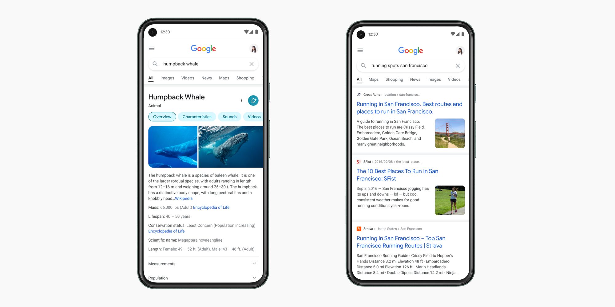
One of the main aims of the redesign was to put more of a focus on the search results rather than the elements around them. To do this, Cheng and her team stripped back the experience, making it quicker for users to identify the information they’re looking for. This is supported by a new edge-to-edge design that not only gives more space for search results but also gives them more “breathing space” for clear presentation.
The text of the search results has been made easier to read. With more space to play with, the result and section titles have been made bigger. A larger, bolder font is used for the results, allowing the human eye to scan them more quickly. There is also more use of Google’s own font, which is partly for brand consistency, but Cheng says that consistency helps people to “parse information more efficiently” too.
Elsewhere, Cheng says the team experimented with using bold or more muted colors to highlight important information within Google Search but found that neither really worked. Instead, the design is built on the more stripped back approach with information and images presented on a clean background. Color is used, but more with the intention of guiding the eye to important information and sparingly to avoid it being overwhelming or distracting.
Finally, the new design “Leans into that ‘Googley’ feeling.” The ’roundness’ found within the Google logo has been pulled across and translated into a bubblier and bouncier look. Like with the extra use of the Google font, this helps to provide brand consistency. “That form is already so much a part of our DNA,” explains Cheng. “Just look at the Search bar, or the magnifying glass.”