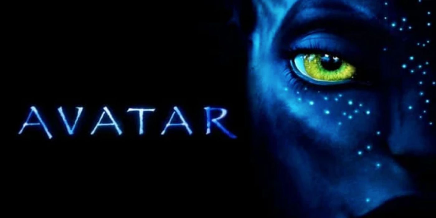
Avatar director James Cameron responds to Ryan Gosling’s iconic “Papyrus” SNL sketch, which mocks the film’s basic font. Released in 2009, Cameron’s Avatar would become the highest-grossing film in history, chronicling a paraplegic marine’s attempts to bond with the alien inhabitants of a lush moon called Pandora. While the movie was a massive hit, an SNL sketch starring Gosling released in 2017 would poke fun at the front used for the film’s logo on all major marketing materials.
Now, as the wait for Avatar 3‘s 2025 release date drags on, Cameron reacts to Gosling’s SNL sketch in a recent interview with People. The director reveals that the sketch actually caused some debate as to how to approach the title font for Avatar: The Way of Water. Check out Cameron’s full comment below:
“I mean, the thing is, we actually now had a dilemma on movie two. It’s like, ‘Are we going to keep the same font, the highest-grossing film in history, or are we going to change it?’ Mess with the formula. It’s like, ‘F— it, we’re using the font.’ If Ryan gets his panties in a bunch over it, then so be it.”
“You’ve got to be able to laugh with and at yourself on Saturday Night Live. They had me light a cigar off a hundred-dollar bill after Titanic became the highest-grossing film in history. First of all, I don’t smoke cigars… and I’d never light a hundred-dollar bill on fire. It’d be a bad thing for my kids to see, but it’s funny.”
Avatar’s Papyrus Font Explained

It’s worth mentioning that the Avatar logo font is technically a modified version of Papyrus, but the oft-mocked font does indeed serve as the base. In fact, the man who designed the movie’s title, Peter Stougaard, a former advertising executive for 20th Century Fox, has previously confirmed as much.
In an interview with The Ringer last year, Stougaard revealed that, with the distribution date for the movie’s poster fast approaching in summer 2009, he was struggling to find the right font. The solution would eventually present itself when he encountered Cameron holding a draft of the Avatar script, which used a Papyrus font for the title treatment. Stougaard would end up thickening the letters and making some adjustments, and Cameron gave the logo design the green light.
While Avatar‘s use of the Papyrus font evidently didn’t affect how enamored audiences would become with the film, it became the perfect target for SNL. The sketch, which is included above, stars Gosling as a graphic designer tortured by the film’s use of the font, and it has since become one of the show’s most iconic shorts. Although Avatar: The Way of Water uses a new font called Toruk, the Papyrus inspiration remains clear. Cameron’s latest comment seemingly affirms that future Avatar movies will continue this trend.


